-
 logo-inline.jpgEnlarge
 -
retail-bags.gifEnlarge
-
brand-book.gifEnlarge
-
 logo-icon.jpgEnlarge
 -
website-home.mp4Enlarge
-
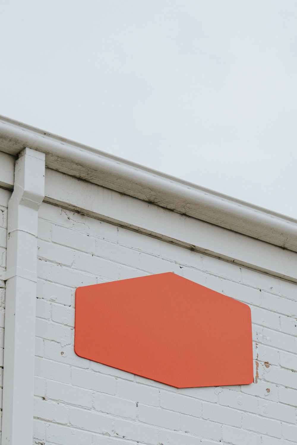 signage.jpgEnlarge
 -
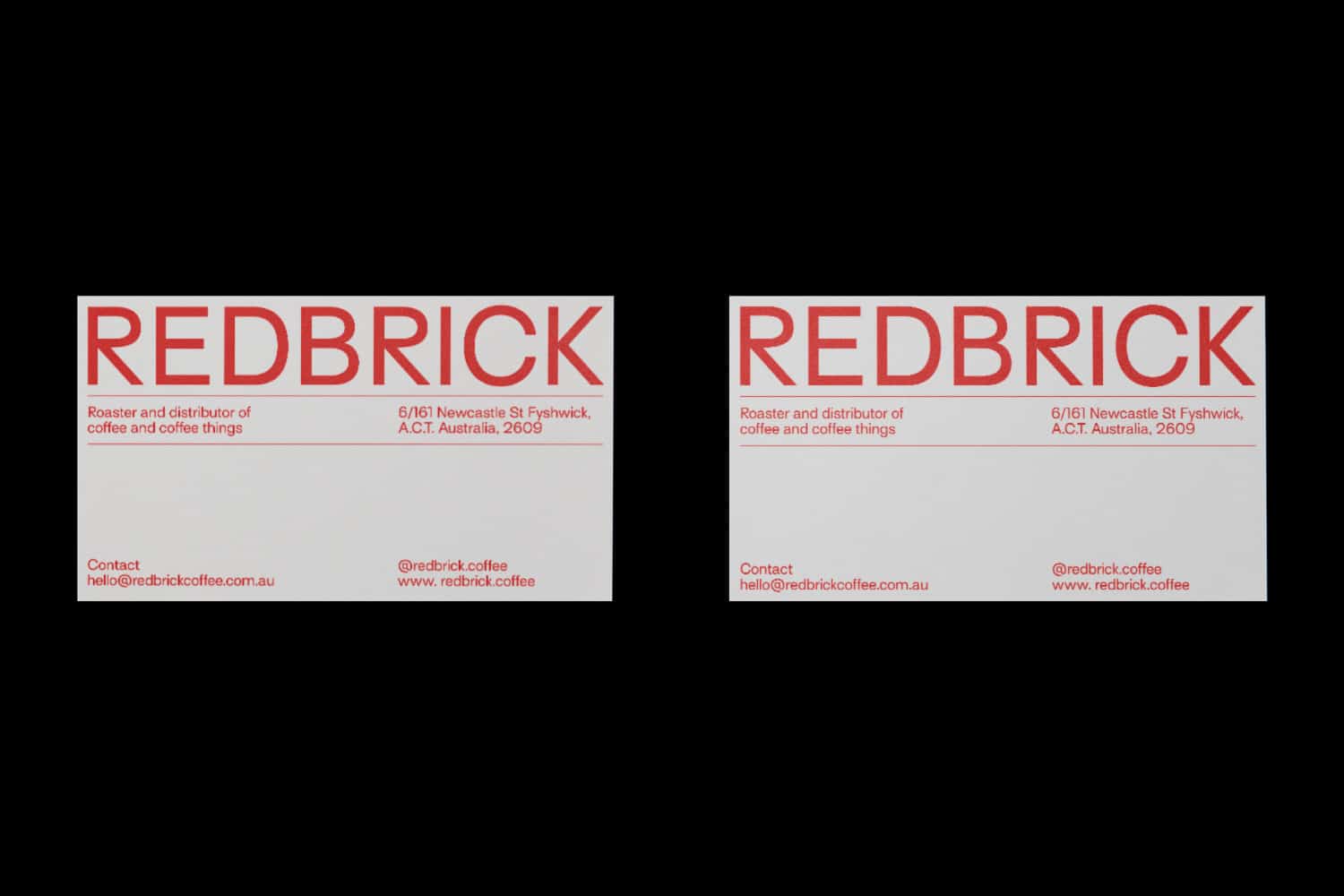 business-cards.jpgEnlarge
 -
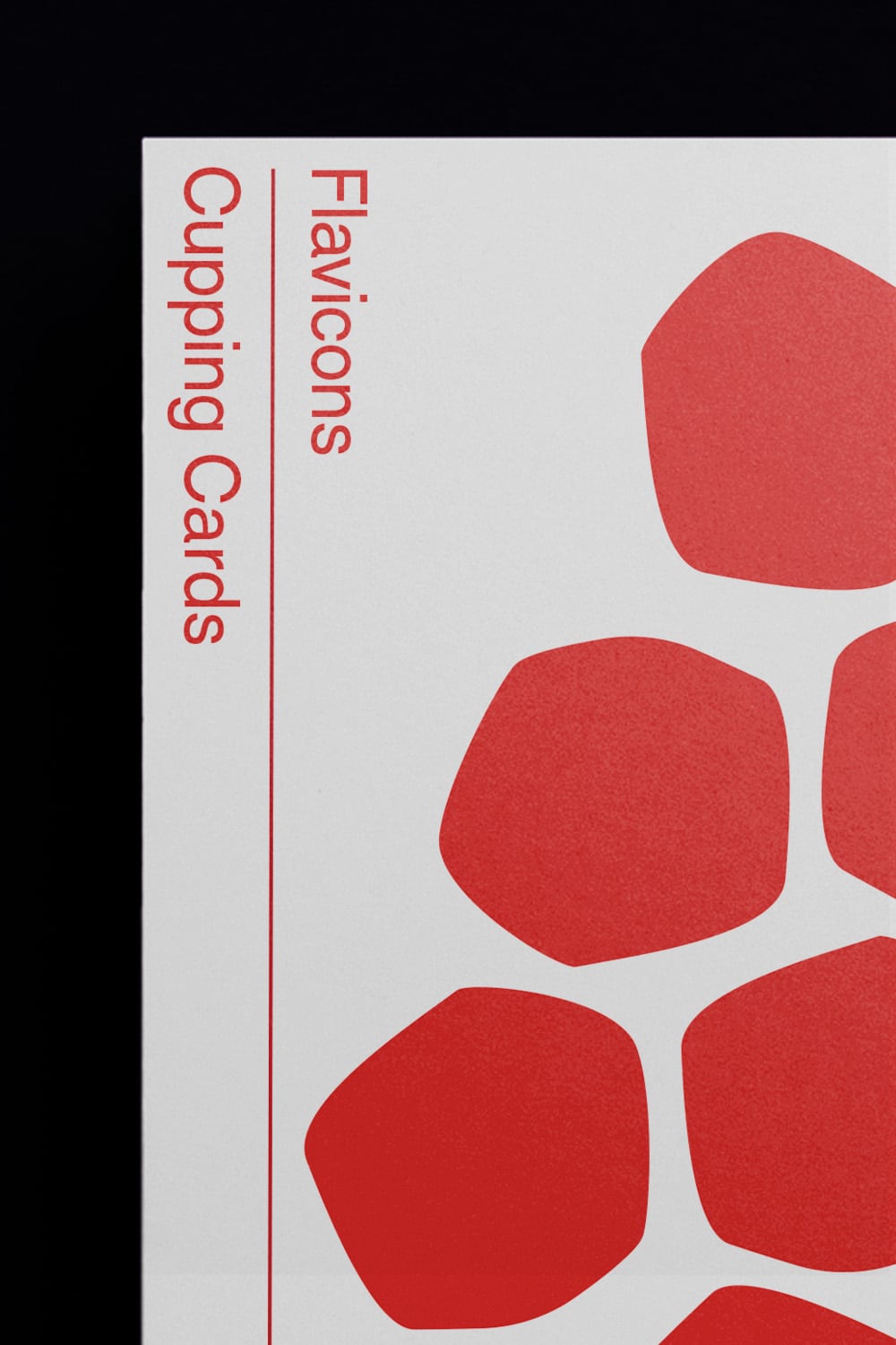
custom-flavicons.gifEnlarge
-
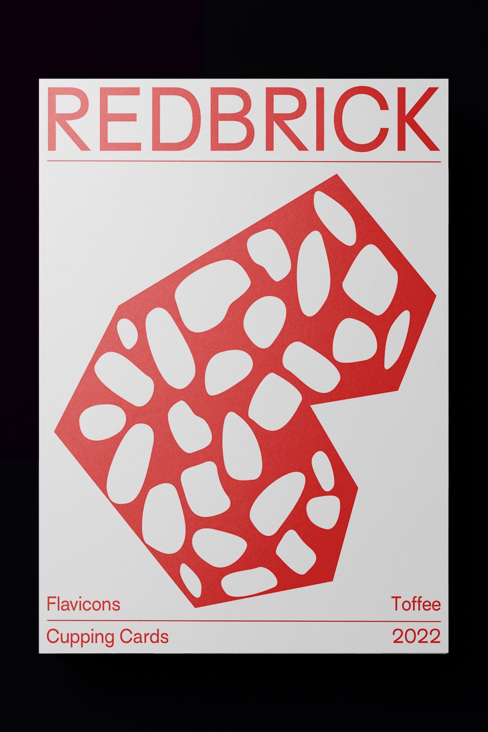
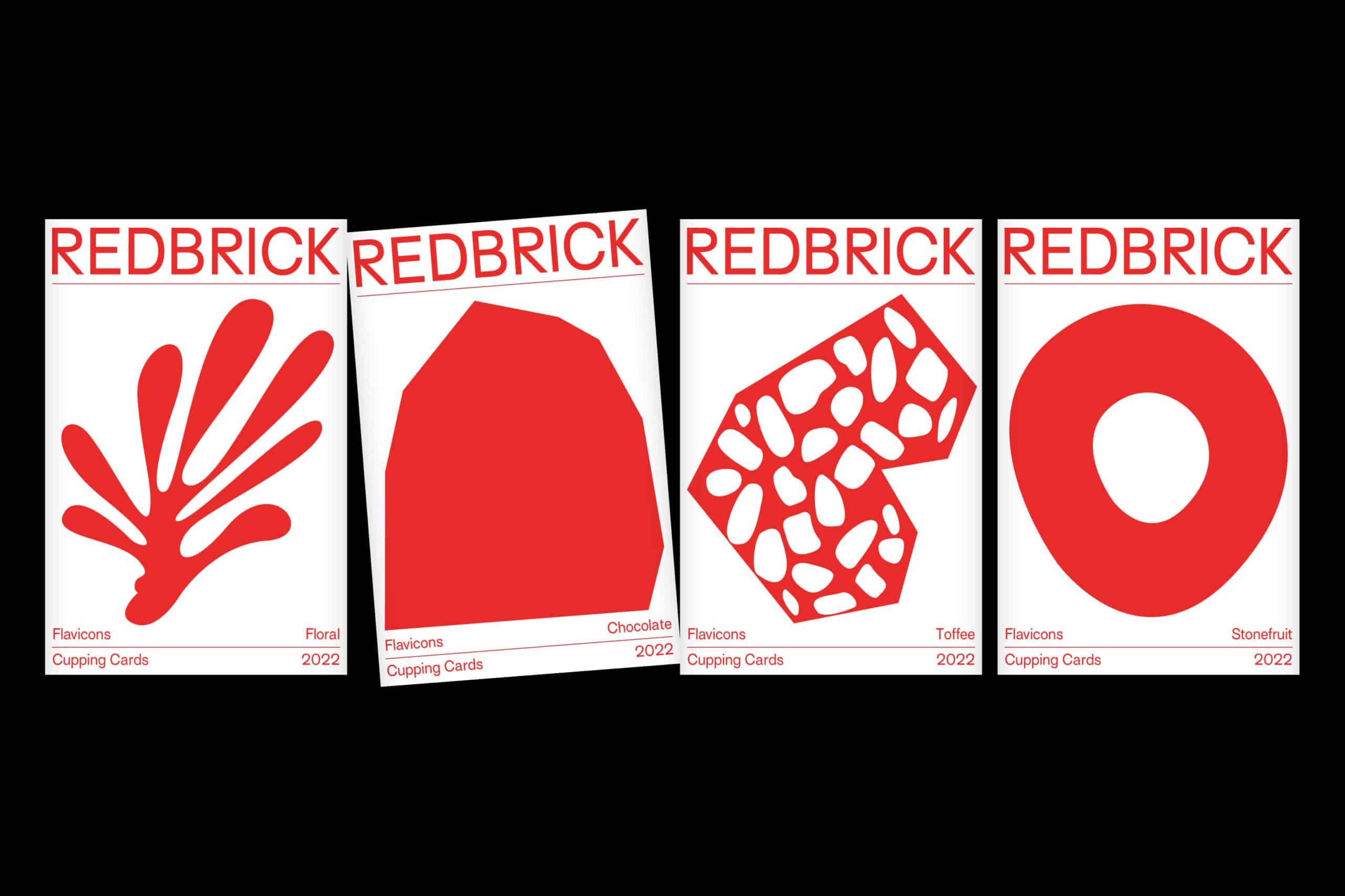 posters-flavicons.jpgEnlarge
 -
 poster.jpgEnlarge
 -
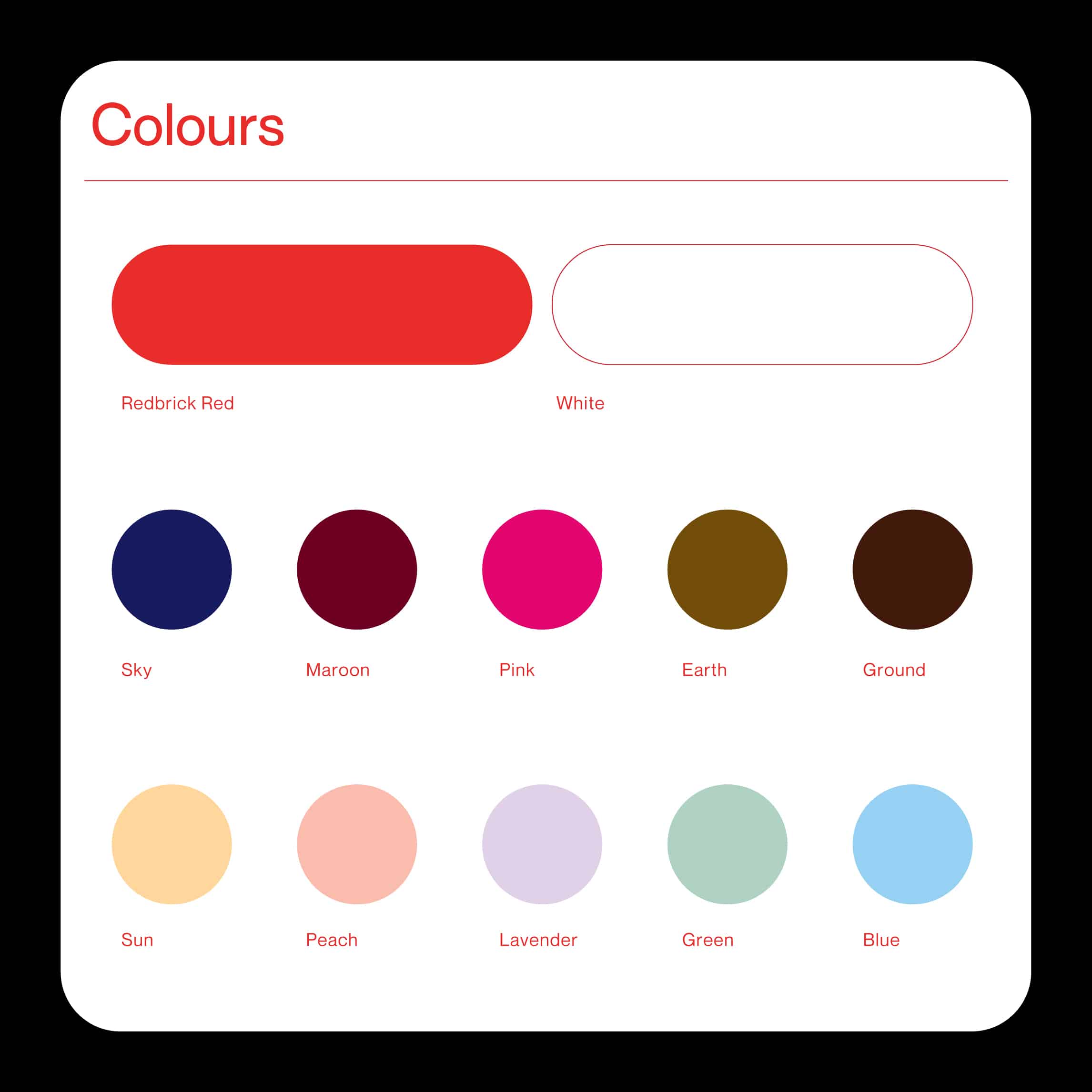 colours.jpgEnlarge
 -
mobile-web.mp4Enlarge
-
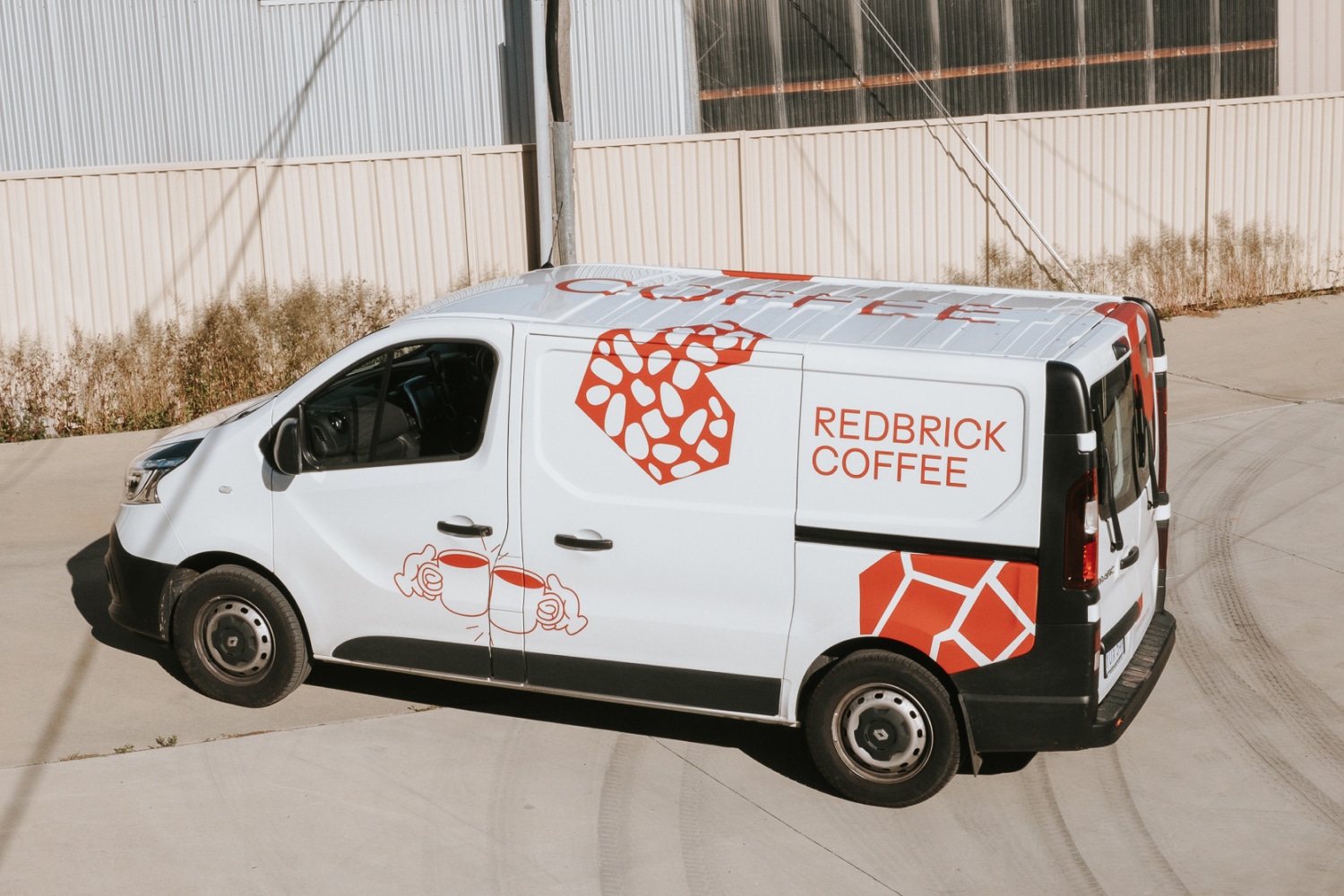 delivery-van.jpgEnlarge
 -
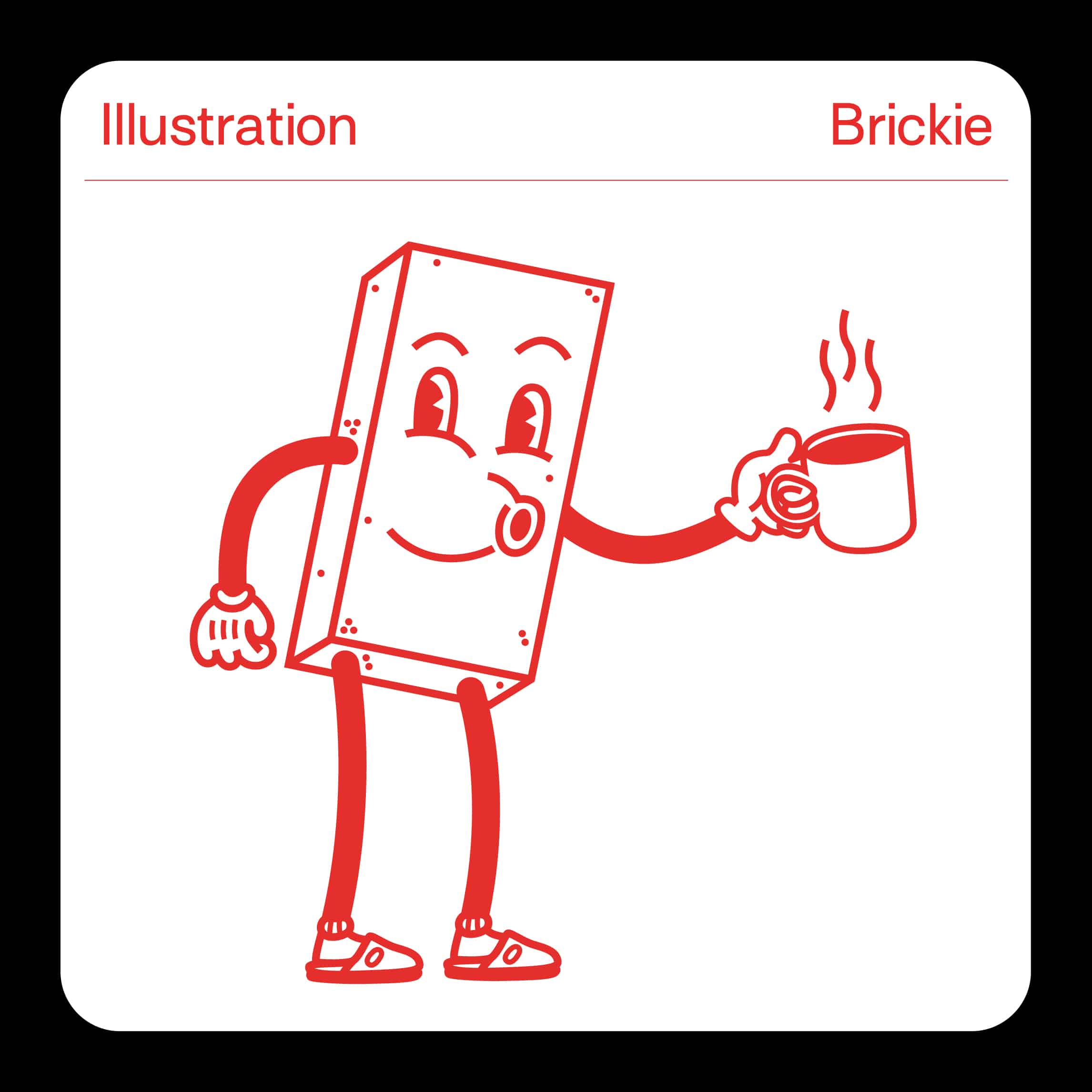 illustration-brickie.jpgEnlarge
 -
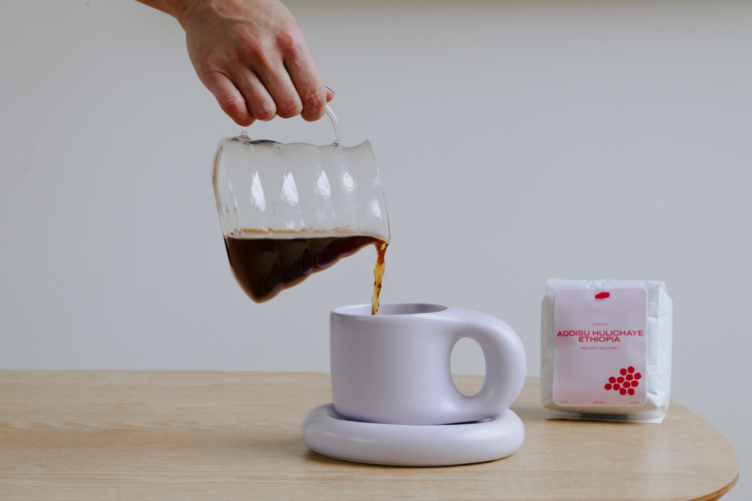
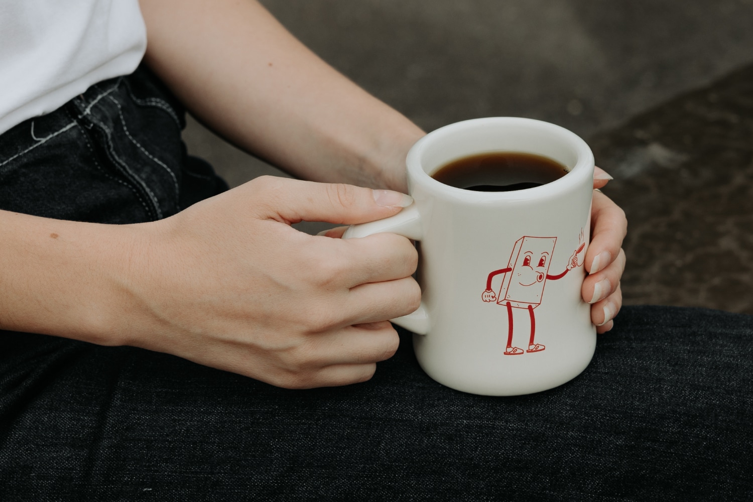 mug.jpgEnlarge
 -
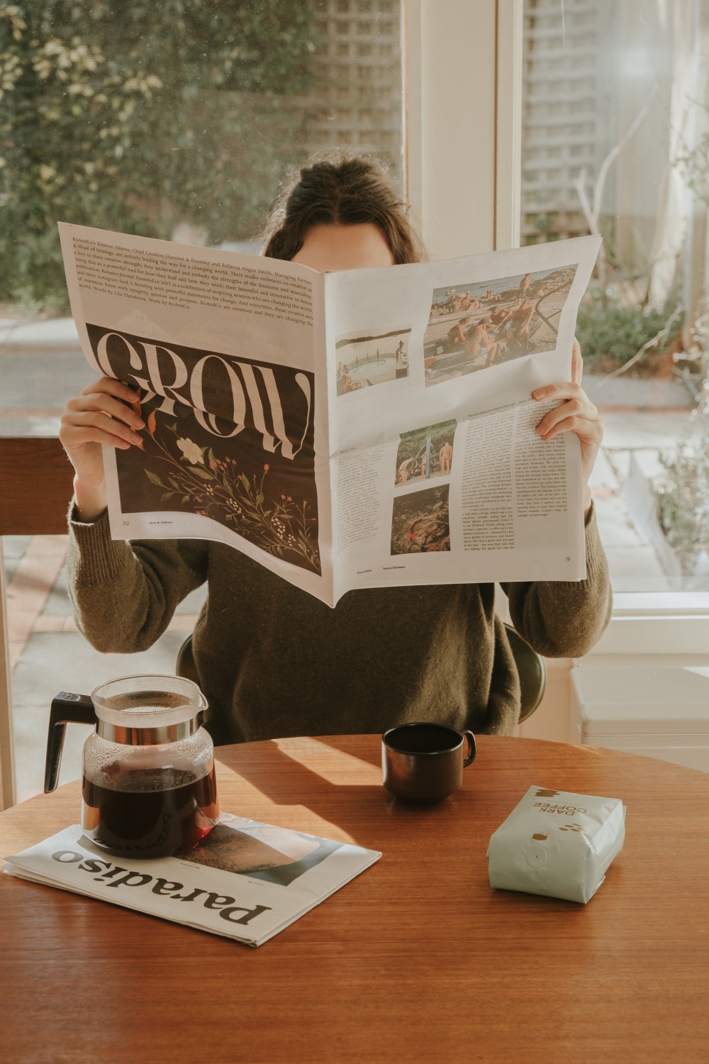 dark-coffee.jpgEnlarge
 -
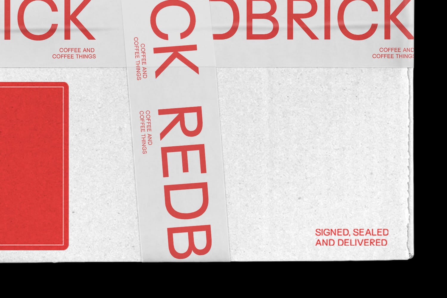 box-crop.jpgEnlarge
 -
 single-bag.jpgEnlarge
 -
mobile-shop.mp4Enlarge
-
 poster-crop.jpgEnlarge
 -
mobile-home.mp4Enlarge
-
 special-release.jpgEnlarge
 -
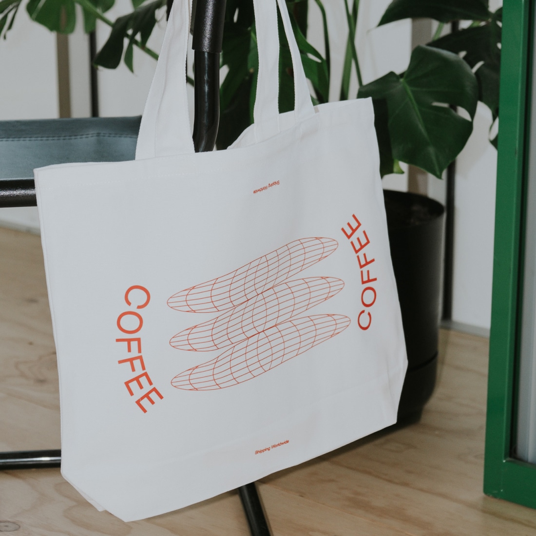 totes.jpgEnlarge
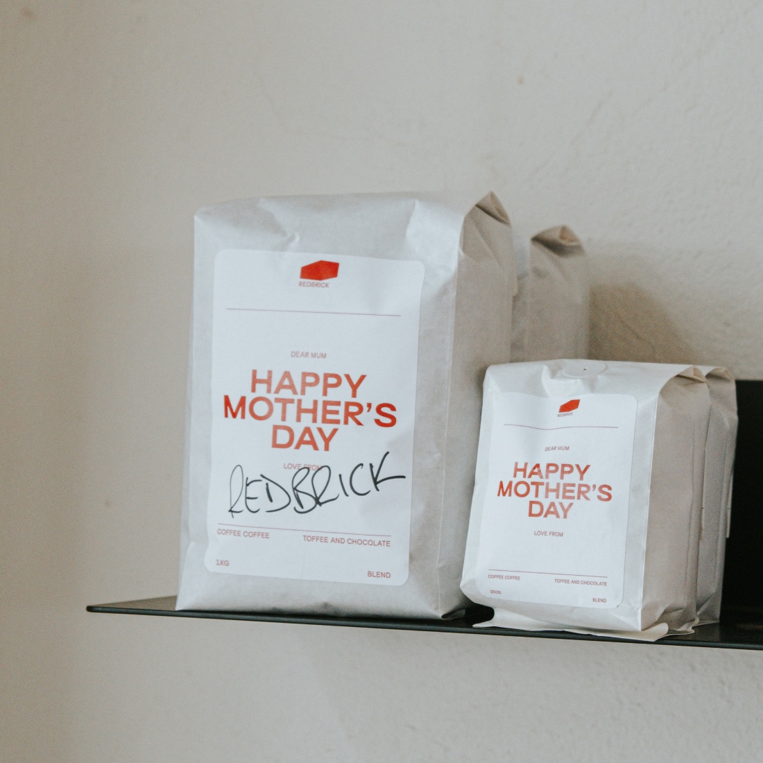
A company about no-fuss, delicious coffee. We wanted to reflect this sentiment by developing an easy-to-identify system for customers to find the coffee that they love. The approach was to use colour to identify categories and communicate flavour through iconography. This system then was rolled across packaging, website, social media, and brand assets.
The goal for the digital experience was to make the website accessible for any type of coffee drinker, no matter the stage of their coffee journey. Through a landing page, with the products front and center, to a considered and categorised shopping experience with clean filtering. We incorporated moments of serendipity that allow the user to uncover hidden content or delve deeper into learning more about the coffee.


