-
 logo.jpgEnlarge
 -
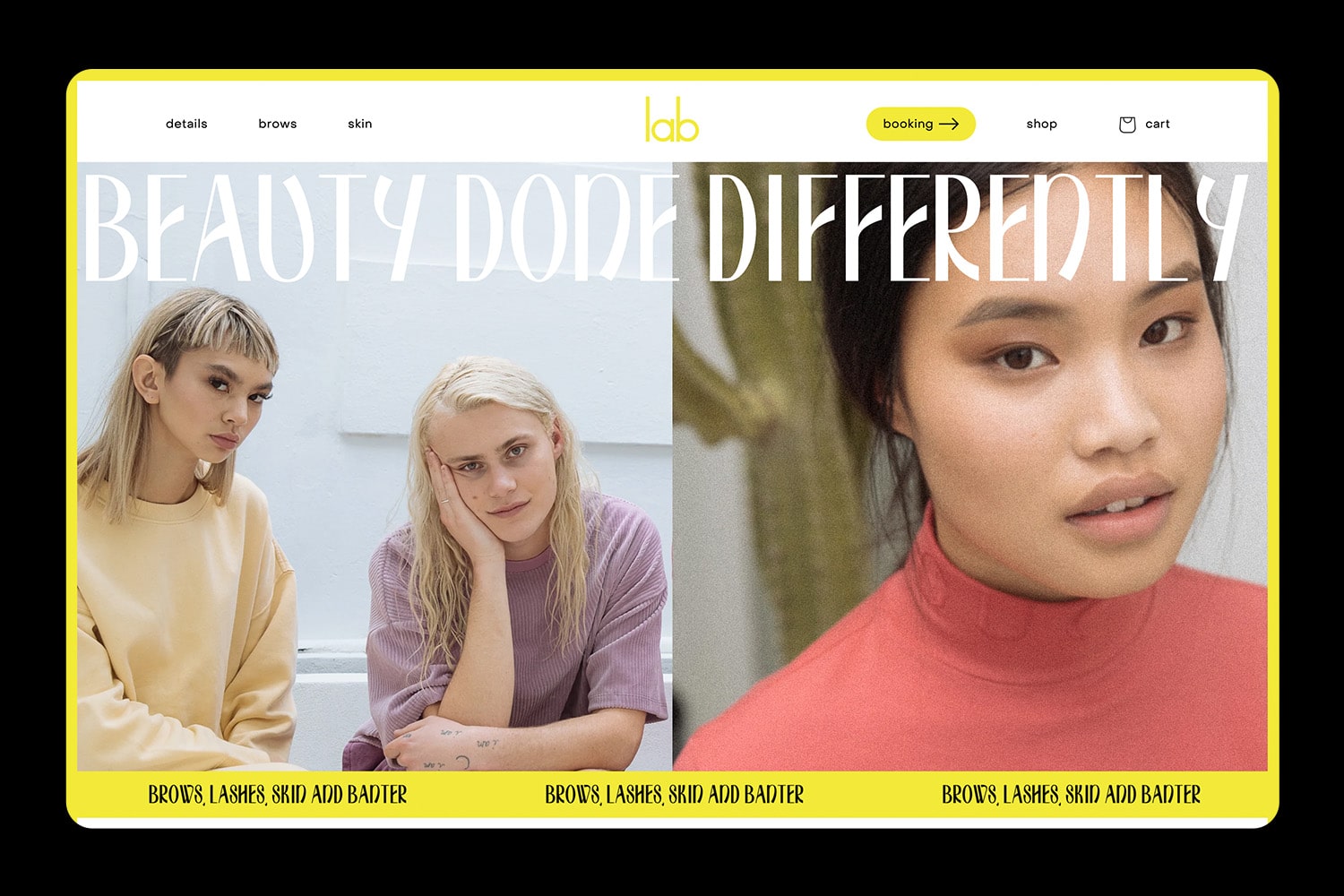 web-home.jpgEnlarge
 -
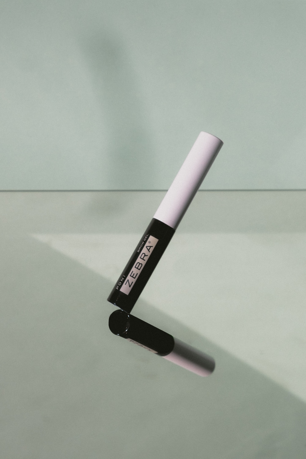 photography.jpgEnlarge
 -
lab-moving.mp4Enlarge
-
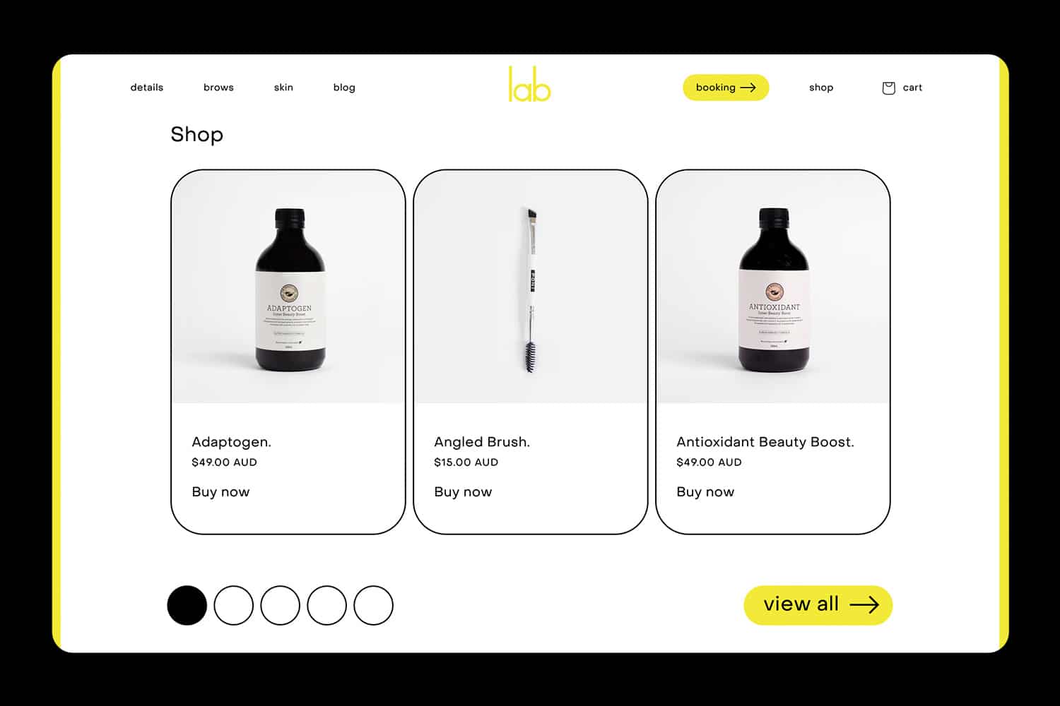 web-shop.jpgEnlarge
 -
 manifesto.jpgEnlarge
 -
icons.gifEnlarge
-
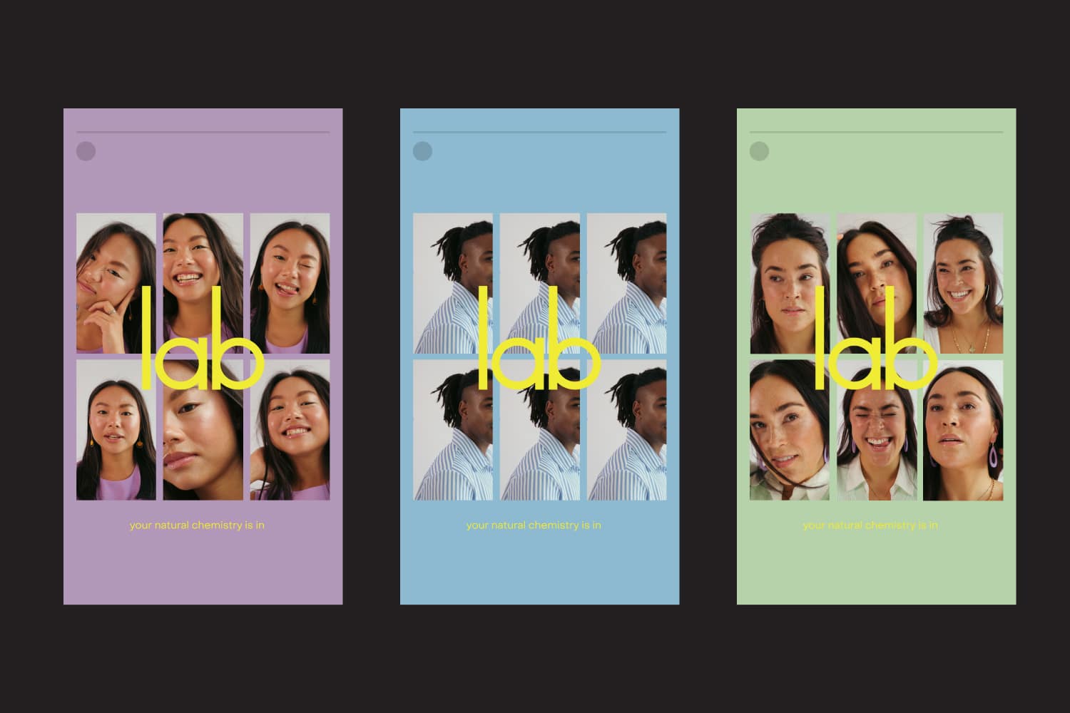
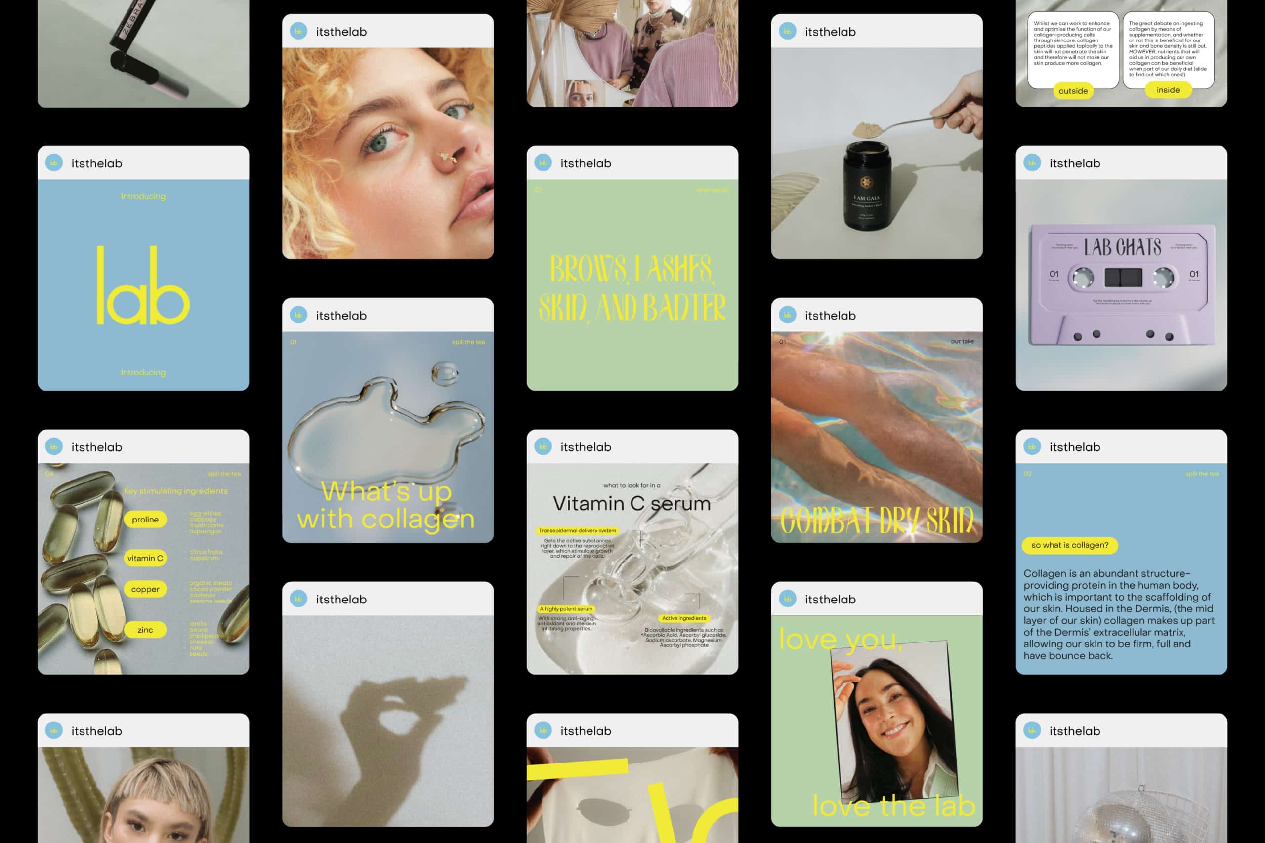 social-feed.jpgEnlarge
 -
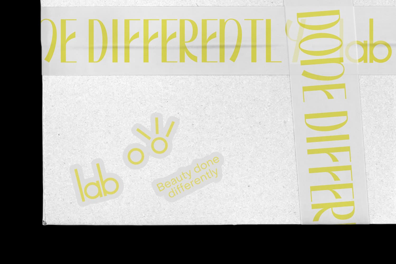 box.jpgEnlarge
 -
moving-images.gifEnlarge
-
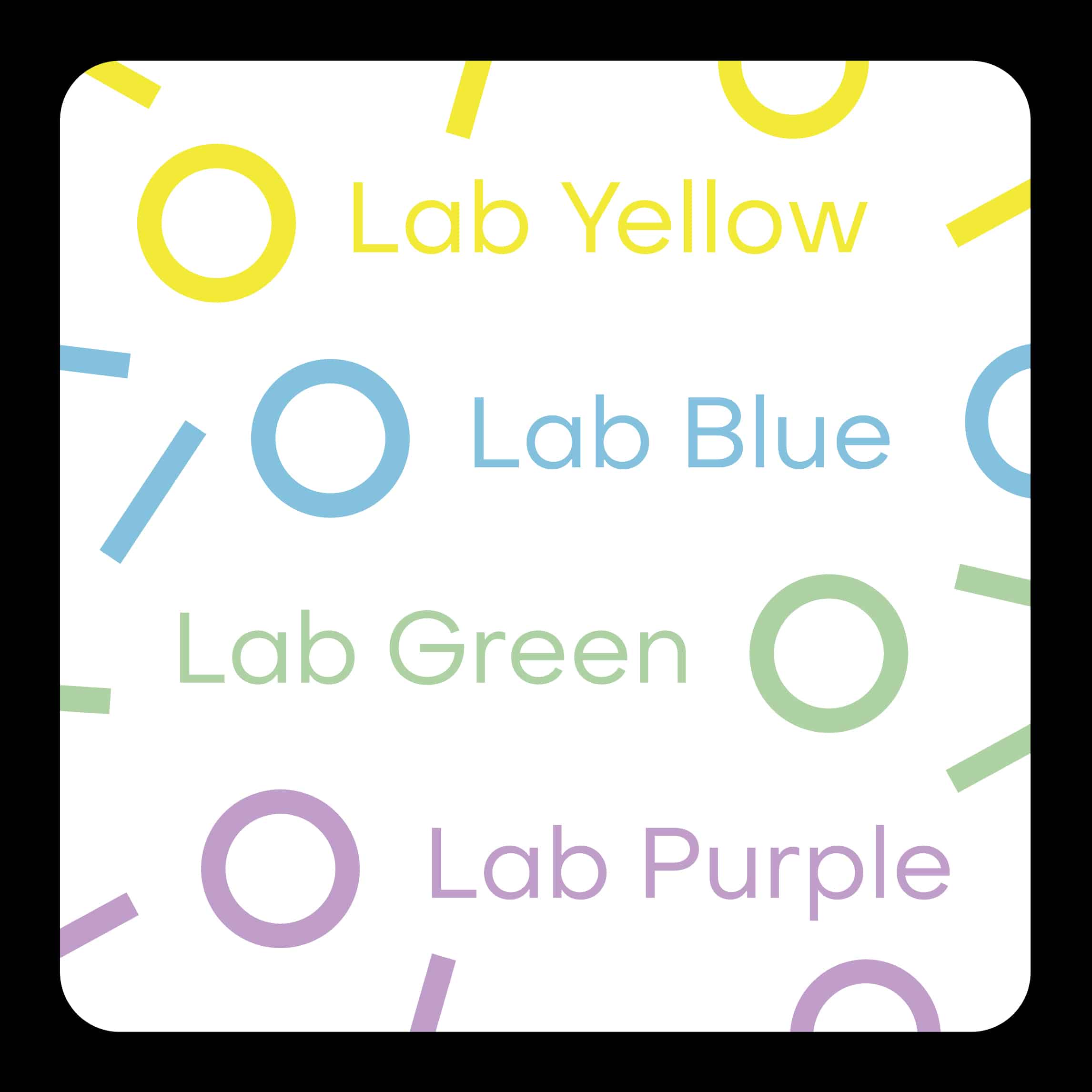 colour.jpgEnlarge
 -
 stories.jpgEnlarge
 -
reel.mp4Enlarge
-
patterns.gifEnlarge
-
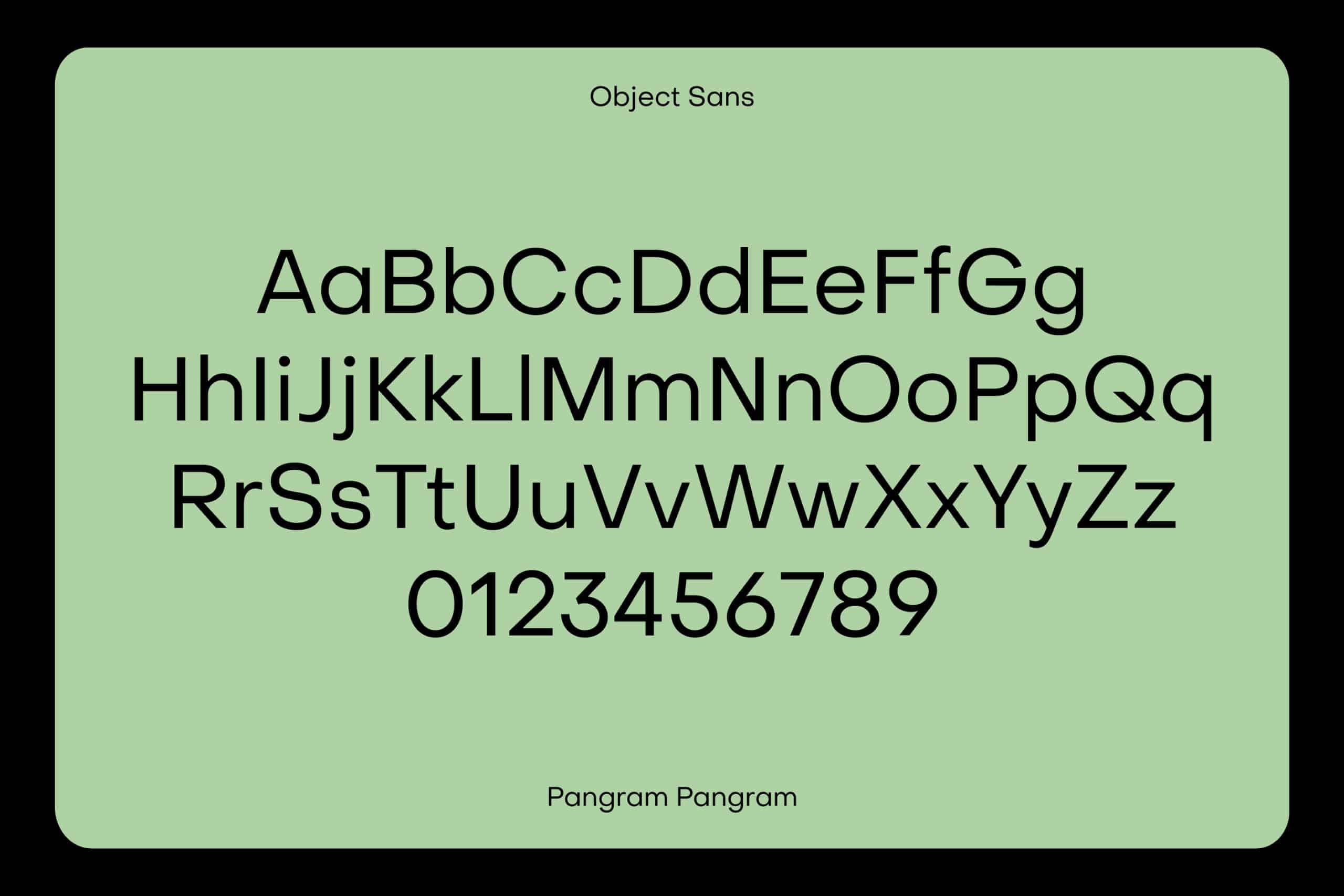 object-sans.jpgEnlarge
 -
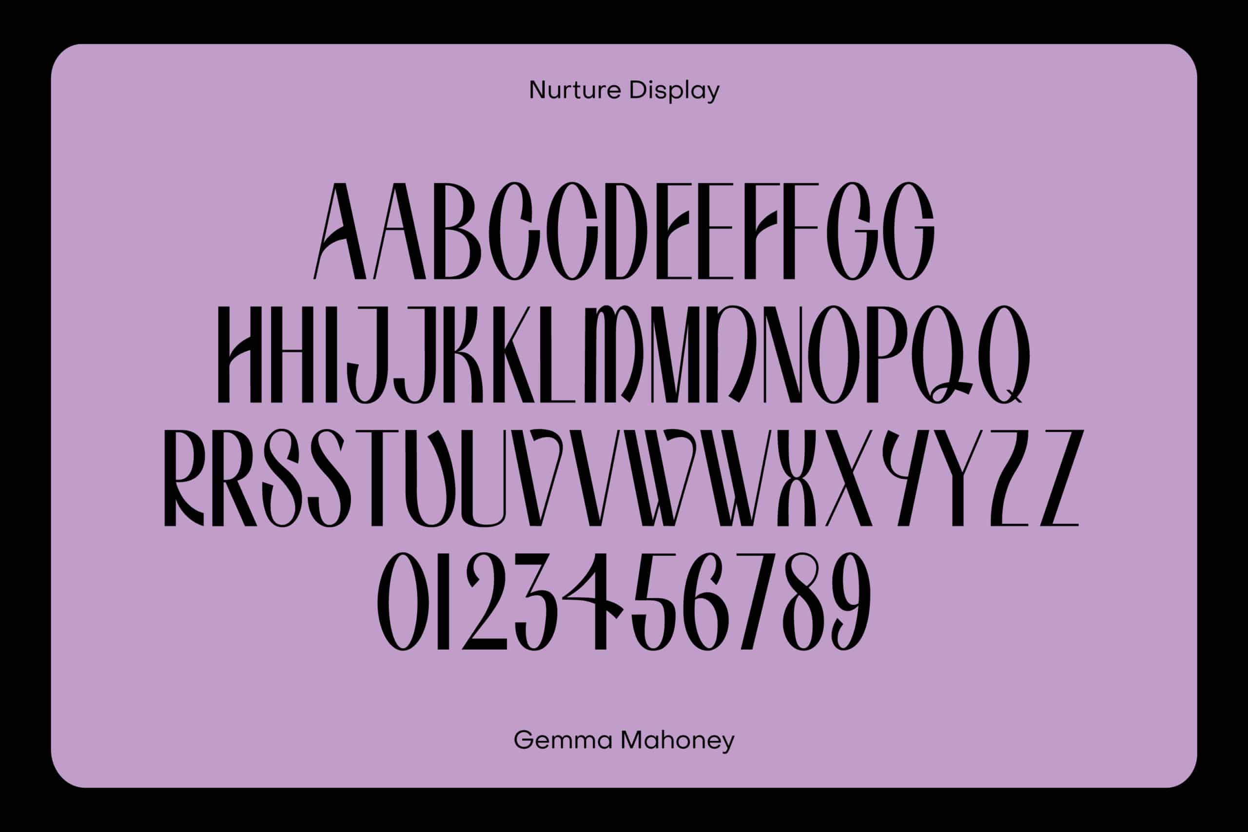 nurture-display.jpgEnlarge
 -
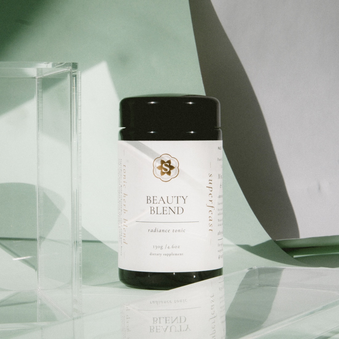 product-photography.jpgEnlarge
 -
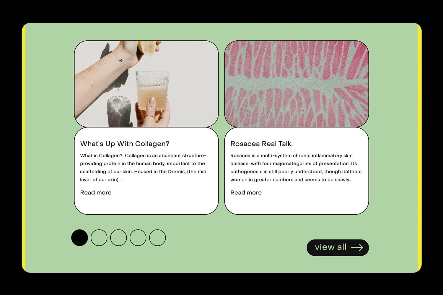 web-blog.jpgEnlarge
Get Info
Client:Lab
Year:2022
Services:Brand Strategy, Brand, Website Design, Content Marketing
In an industry saturated with neutrals and pinks, our aim was to create a brand that wasn’t restricted by beauty standards. We created a mark that can mould and change, be minimal or playful, colourful or paired back. Built from five simple shapes: two circles and three rectangles. This then builds into three icons that represent the brand’s core offering.
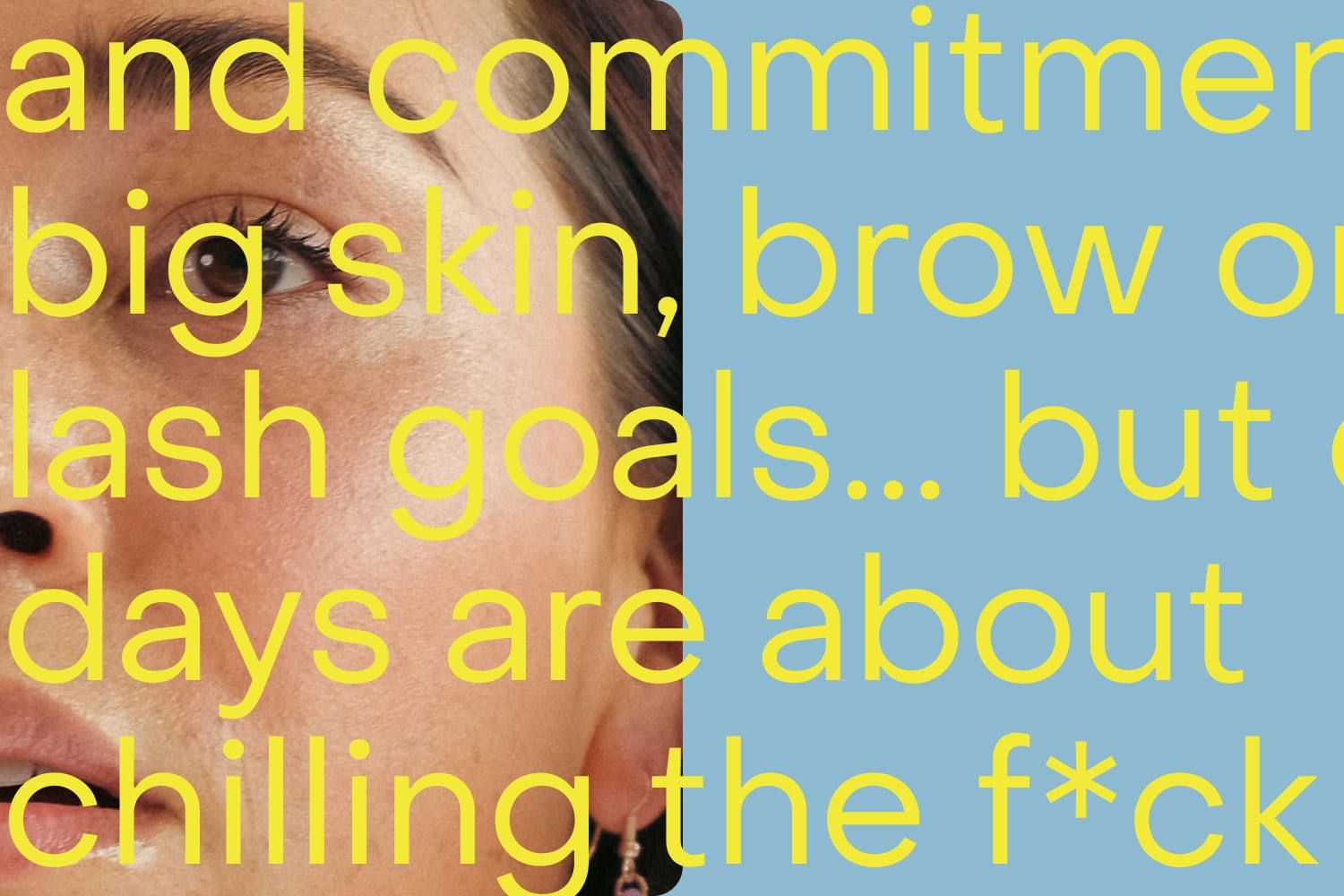
The colours are bold and nostalgic and are used together or individually as punchy backgrounds. We introduced a quirky title font with curves that resemble lashes and brows to command the attention of the layouts so the logo doesn’t need to do all the work.
We continue to work with the client on implementing this new approach across their social media content, website and packaging.
Design:Benny Grocott
Strategy:Jessica Di Scipio
Strategy:Bronte Morgan
Designer:Declan Florence


