-
 kundalini-brand.jpgEnlarge
 -
 brand-guidelines.jpgEnlarge
 -
 posters.jpgEnlarge
 -
mark.gifEnlarge
-
colour-palette.gifEnlarge
-
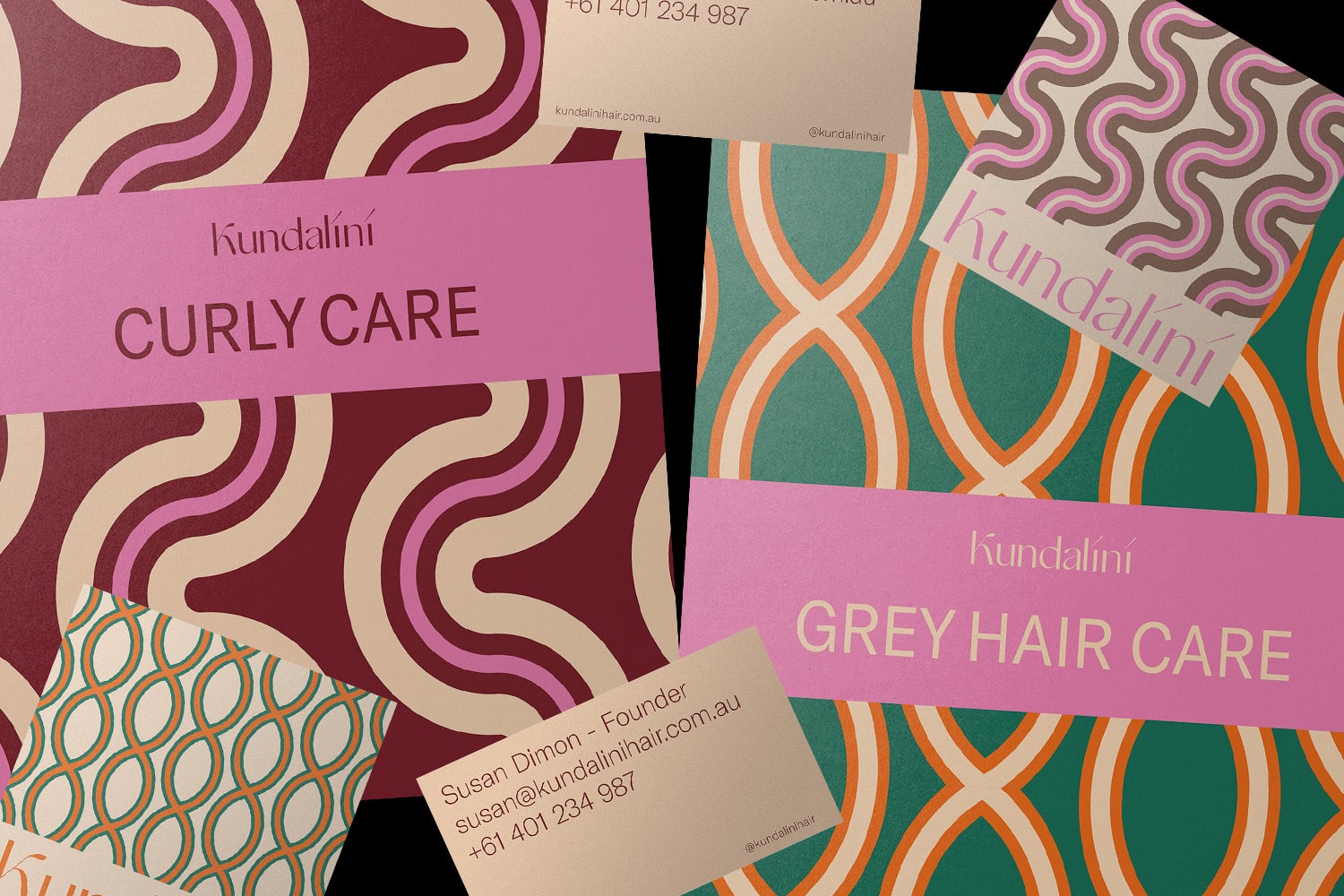
 curly-card.jpgEnlarge
 -
website-home.mp4Enlarge
-
pattern-cards.gifEnlarge
-
 five-colour-sets.jpgEnlarge
 -
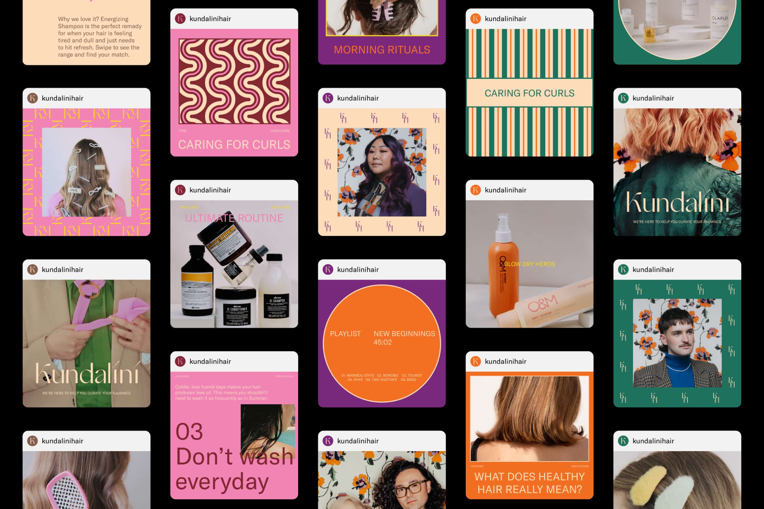 social-feed.jpgEnlarge
 -
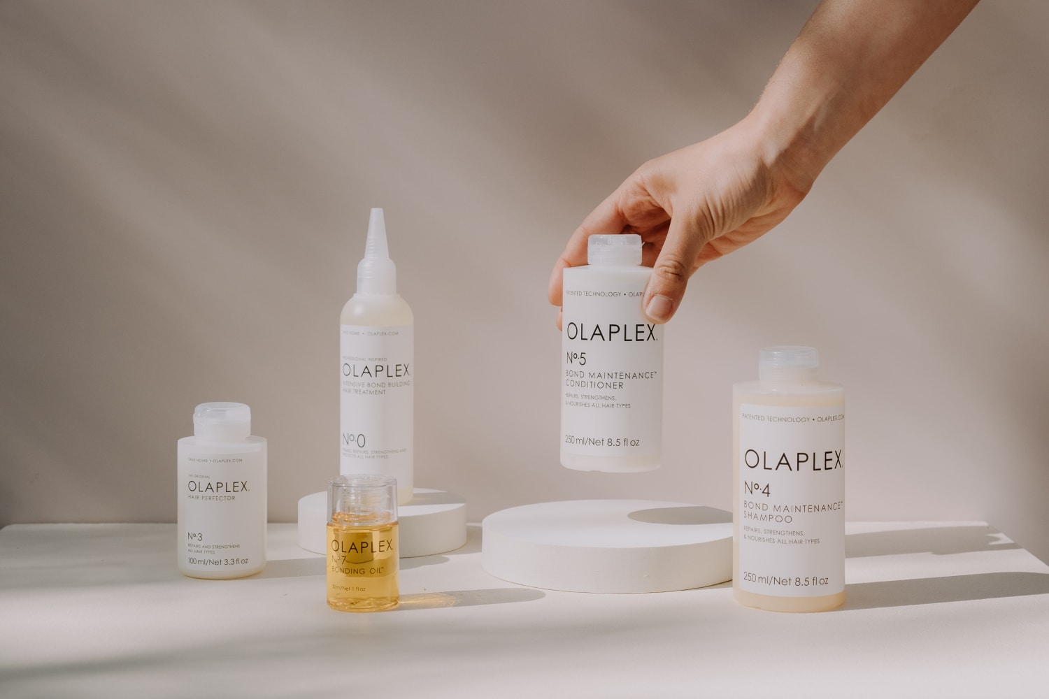 product-group.jpgEnlarge
 -
 icon-sets.jpgEnlarge
 -
product-page.mp4Enlarge
-
 staff-moni.jpgEnlarge
 -
mobile-website.mp4Enlarge
-
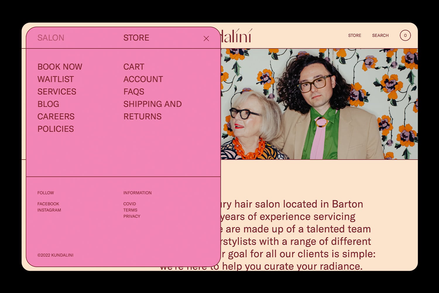 website-menu.jpgEnlarge
 -
 editorial-product.jpgEnlarge
 -
 wavy-card.jpgEnlarge
 -
 product.jpgEnlarge
 -
 type.jpgEnlarge
 -
 product-group.jpgEnlarge
 -
 print-collateral.jpgEnlarge
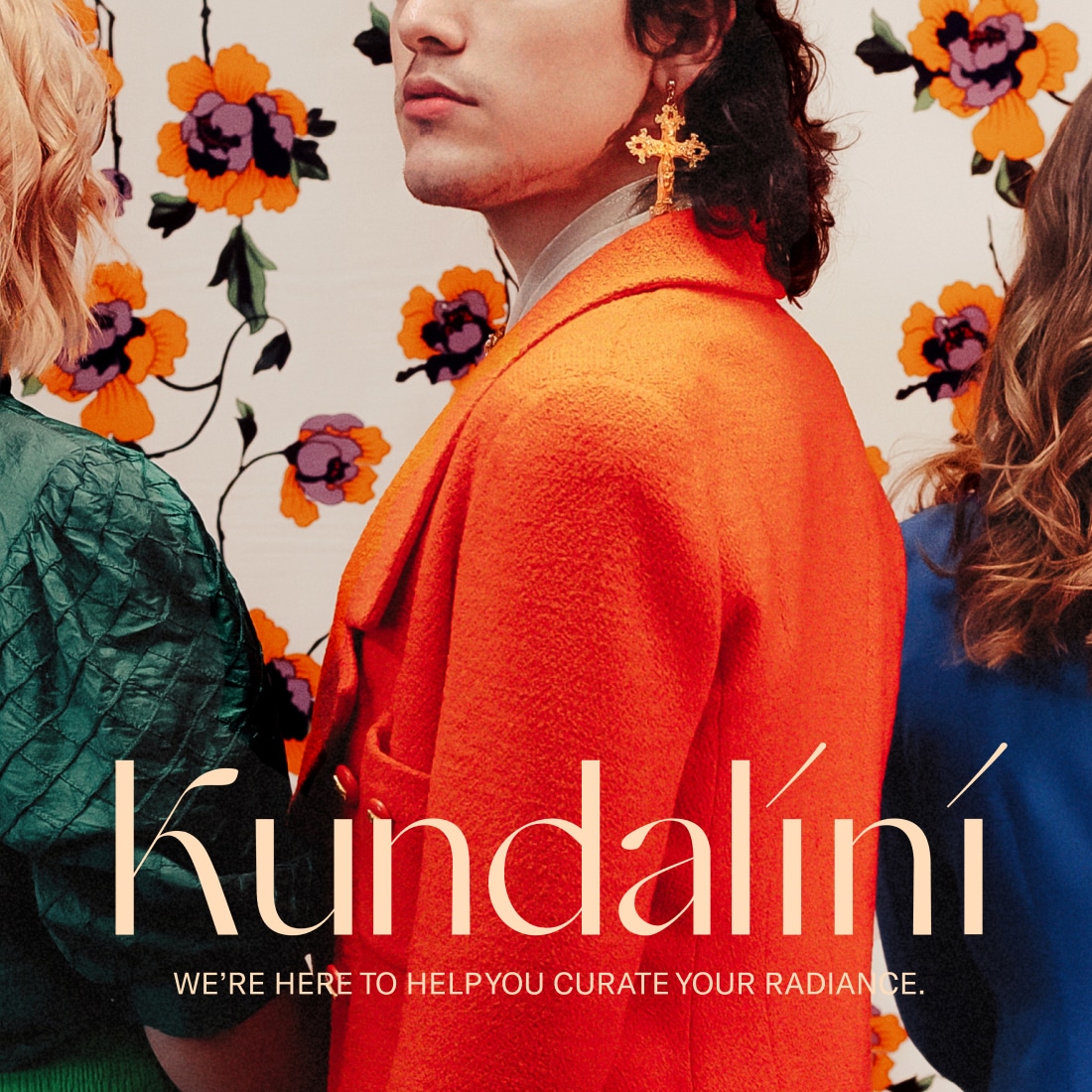
Kundalini, meaning ‘divine female energy’. We expanded on this to be more inclusive and gender diverse. Looking at energy as the idea of radiating, glowing and expanding and pairing that with their practice of curating.
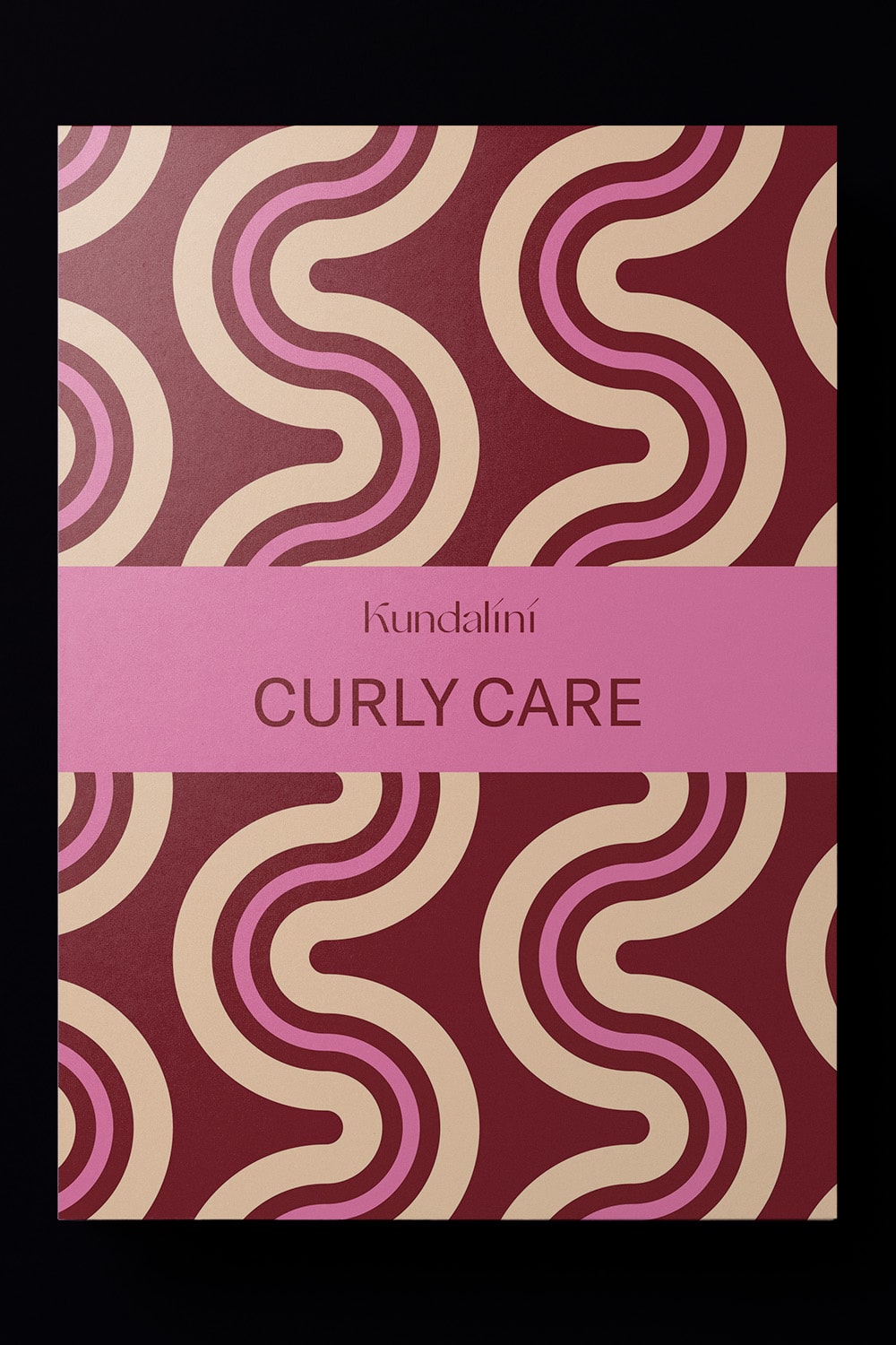
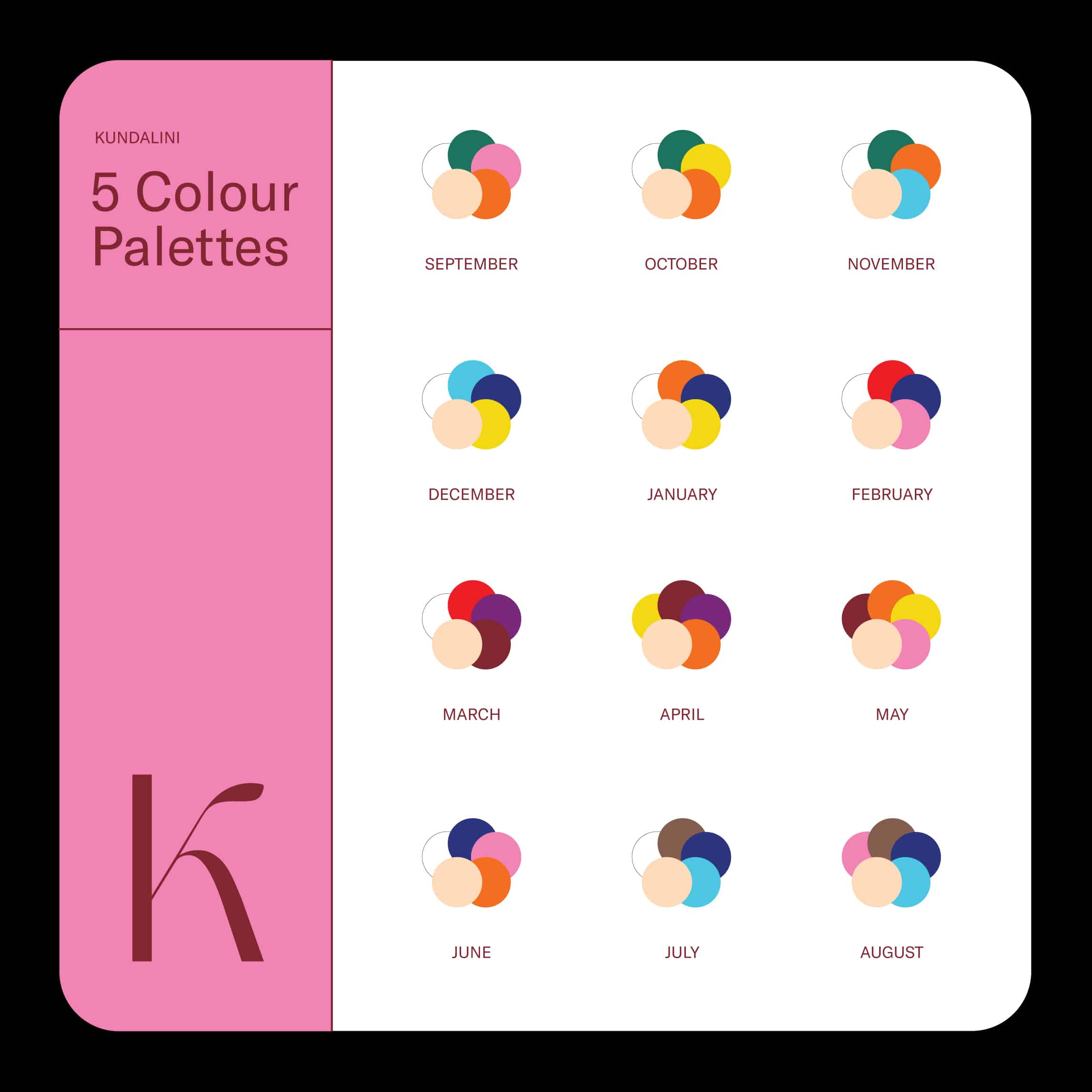
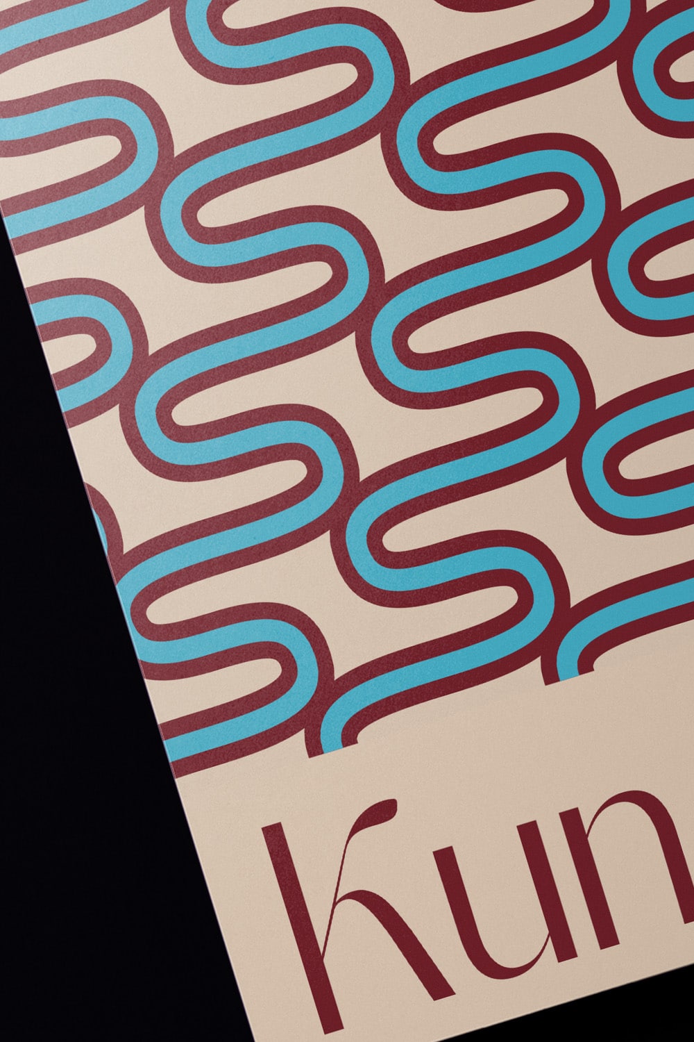
Kundalini, curating your radiance, was the foundation of the brand which came to life with a range of abstract hair-based patterns, custom iconography and an evolving colour palette. The basis for the colour palette was natural hair colours, which were then integrated with vibrant and moody tones to create depth. The colour palette consistently ties back to hair in abstracted forms and tones, while avoiding literal representation.
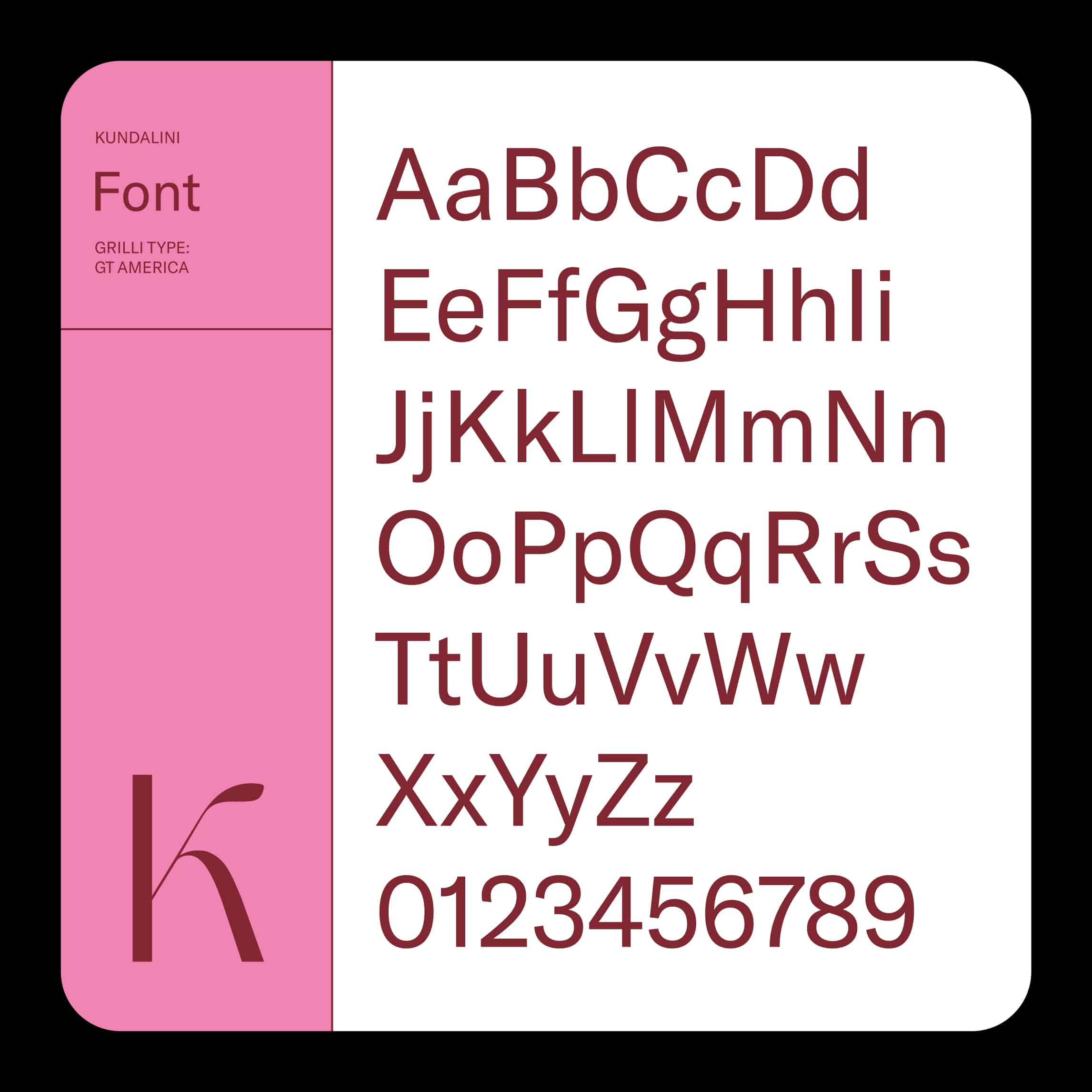
The wordmark is a custom typemark. We looked to blend the elegance of a display serif with the structure of a solid san-serif. This created a number of interesting interactions between the letterforms. We paired this mark with GT America for its clean legibility that complimented the more expensive patterns and imagery.
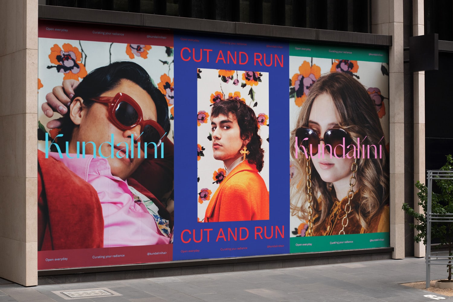
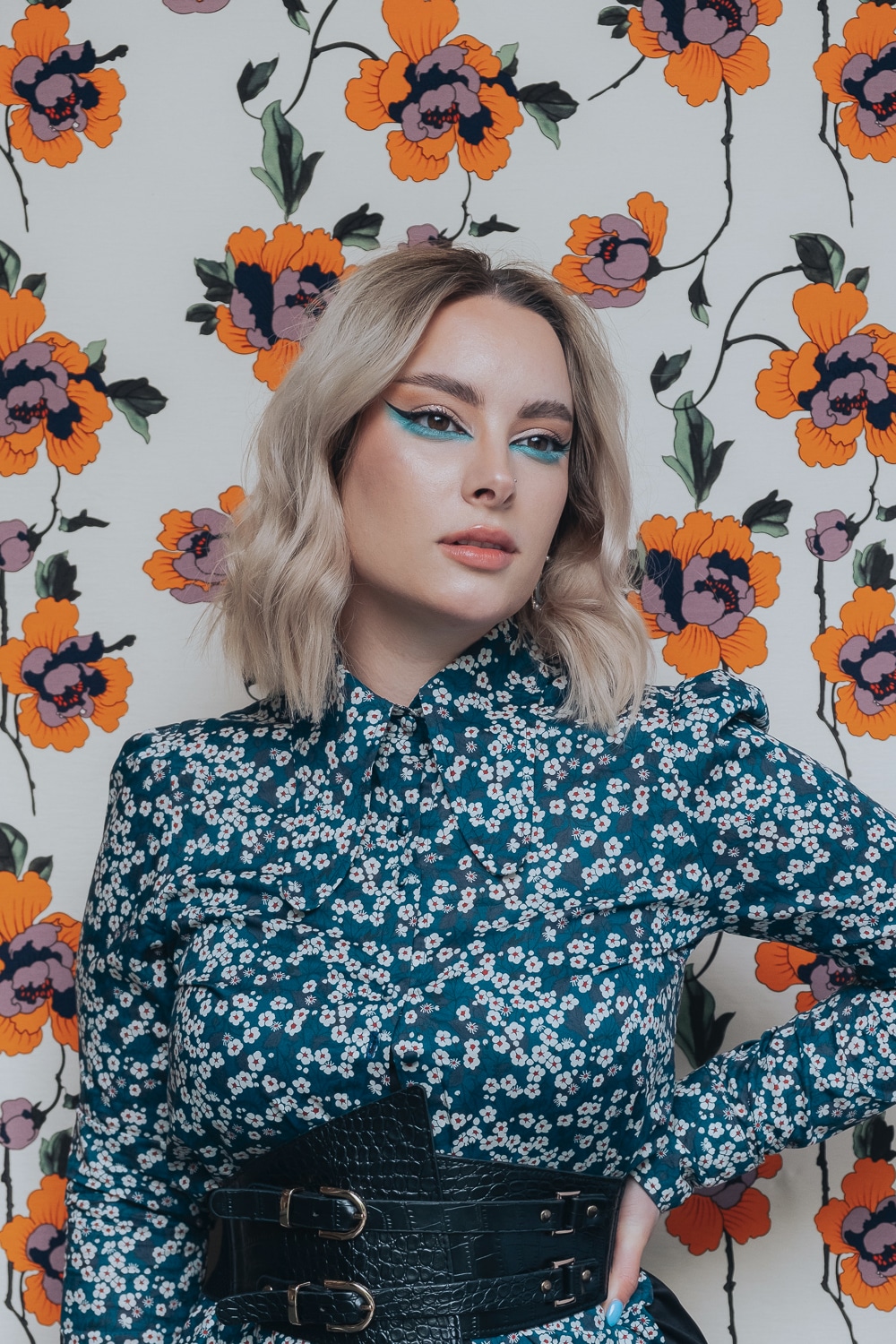
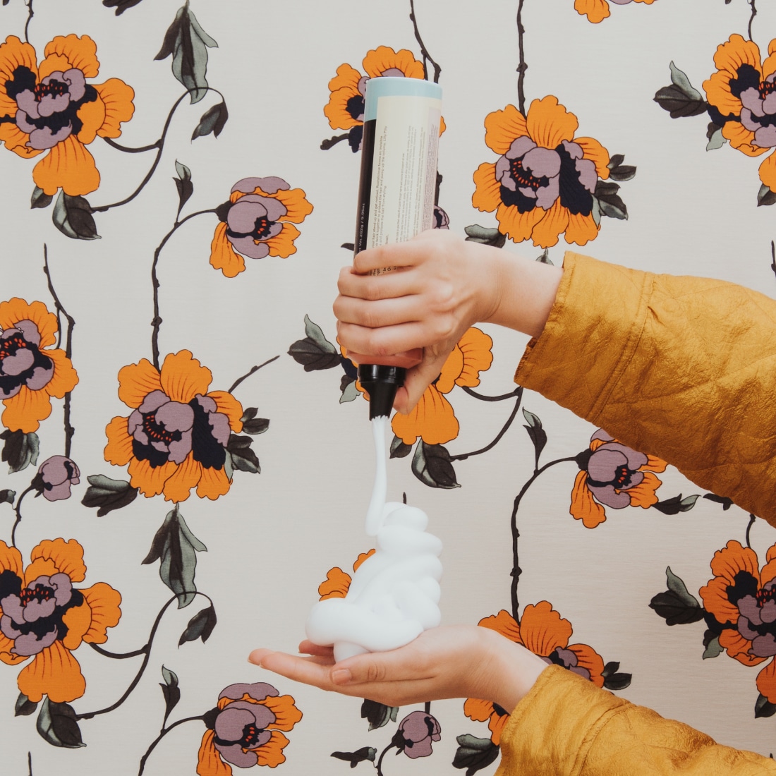
This all came to life with a vibrant editorial. Where we invited staff and clients to participate. Pairing extravagant styling and set backdrops with real people. No models, just people having a great time. Not only did this help position the brand in a new light it ignited the team’s creative energy to move into this new chapter.


