-
 logo.jpgEnlarge
 -
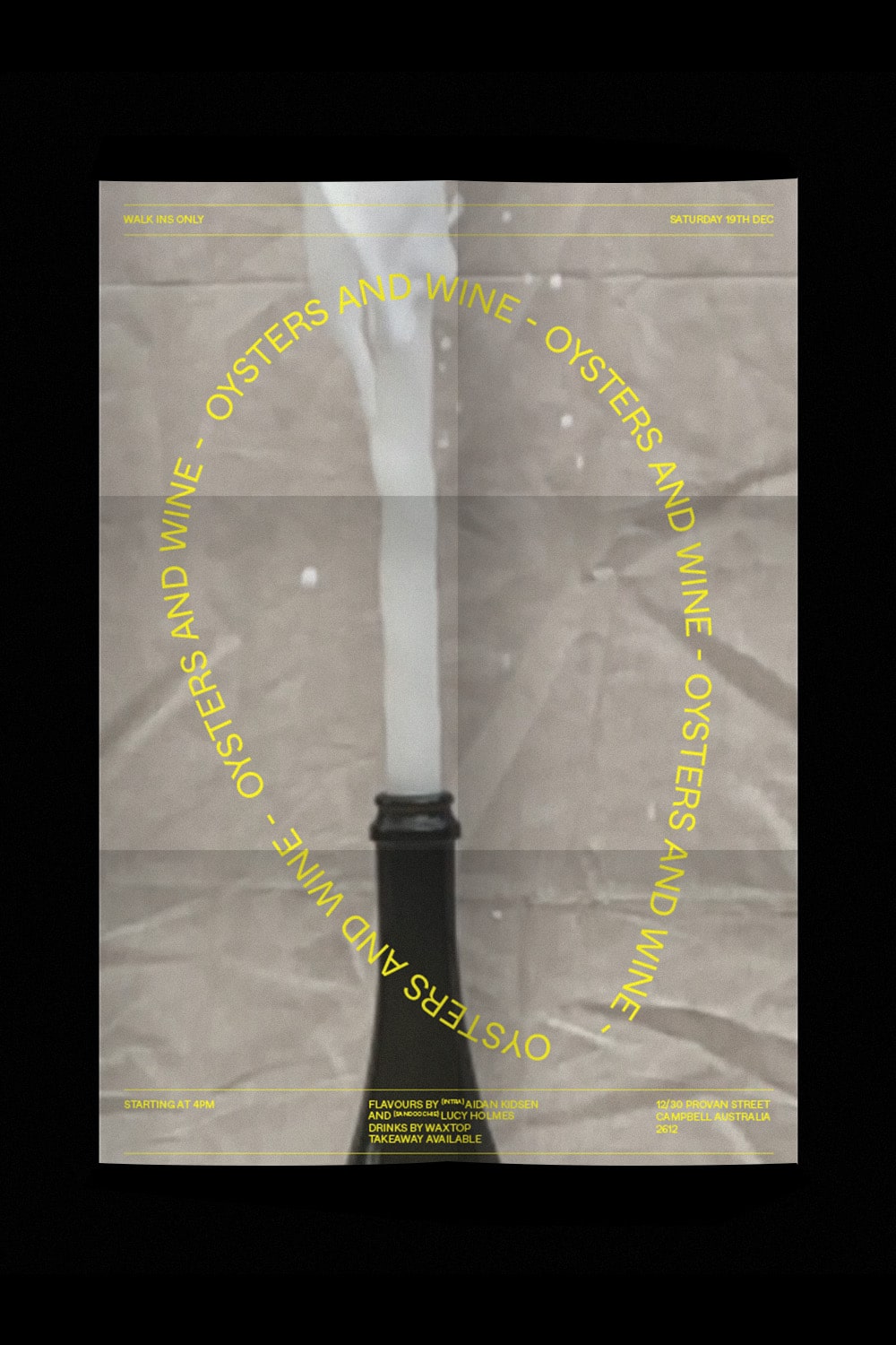 oyster-poster.jpgEnlarge
 -
menu.gifEnlarge
-
intra-x-para.gifEnlarge
-
lowercase-eye.gifEnlarge
-
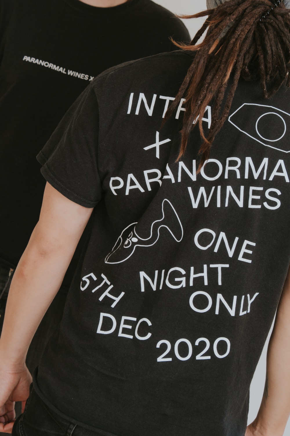 collaboration_tees.jpgEnlarge
 -
spiced-nuts.gifEnlarge
-
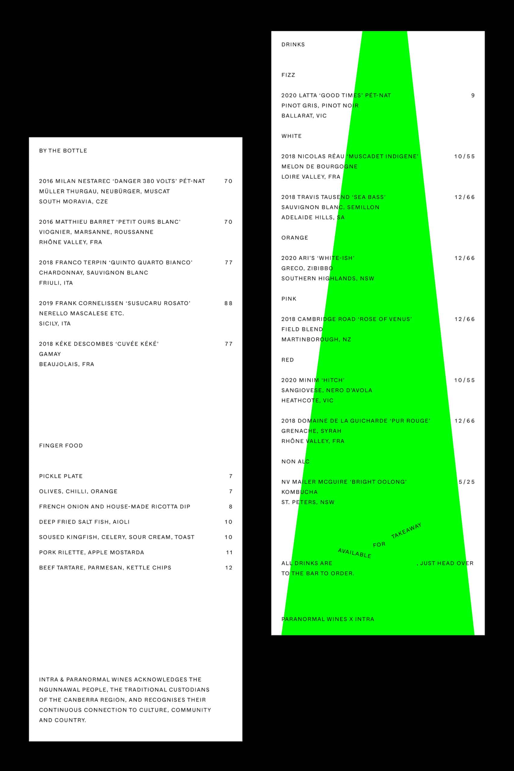 paranormal-menu.jpgEnlarge
 -
 intra-signage.jpgEnlarge
 -
temperada-takeover.gifEnlarge
-
website.gifEnlarge
-
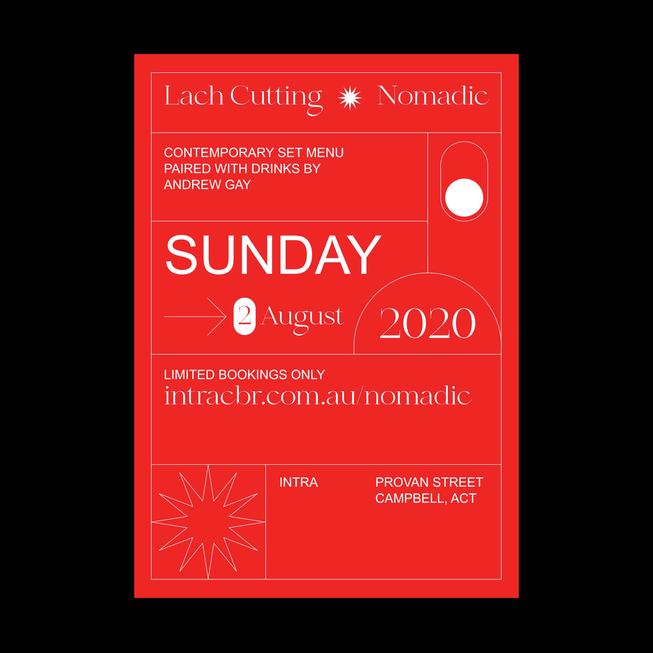 nomadic-poster.jpgEnlarge
 -
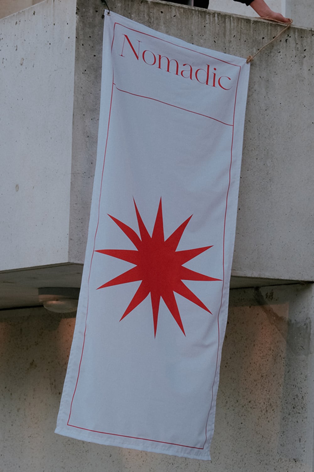 nomadic-flag.jpgEnlarge
Get Info
Client:Intra
Year:2020
Services:Brand, Design, Website Design and Development
In 2020 we worked with the team at Intra to create an iconic mark and visual presence for the much-loved cafe in Campbell.
The brand has a hero mark and a simple sans serif wordmark. The mark in its simplest form is the tittle for the i, however, when shown in isolation it transforms into “the eye”, which represents the idea of the more I interact the more I see. The more I see the more I know. The more I know, the more I know Intra. The eye is the guide it leads the people in the direction of good food, good drinks, and a warming community.
Acting as a mascot, the eye is the hero feature for the store’s signage and the website homepage. A recognisable mark that plays a part in telling this brand’s story.


