-
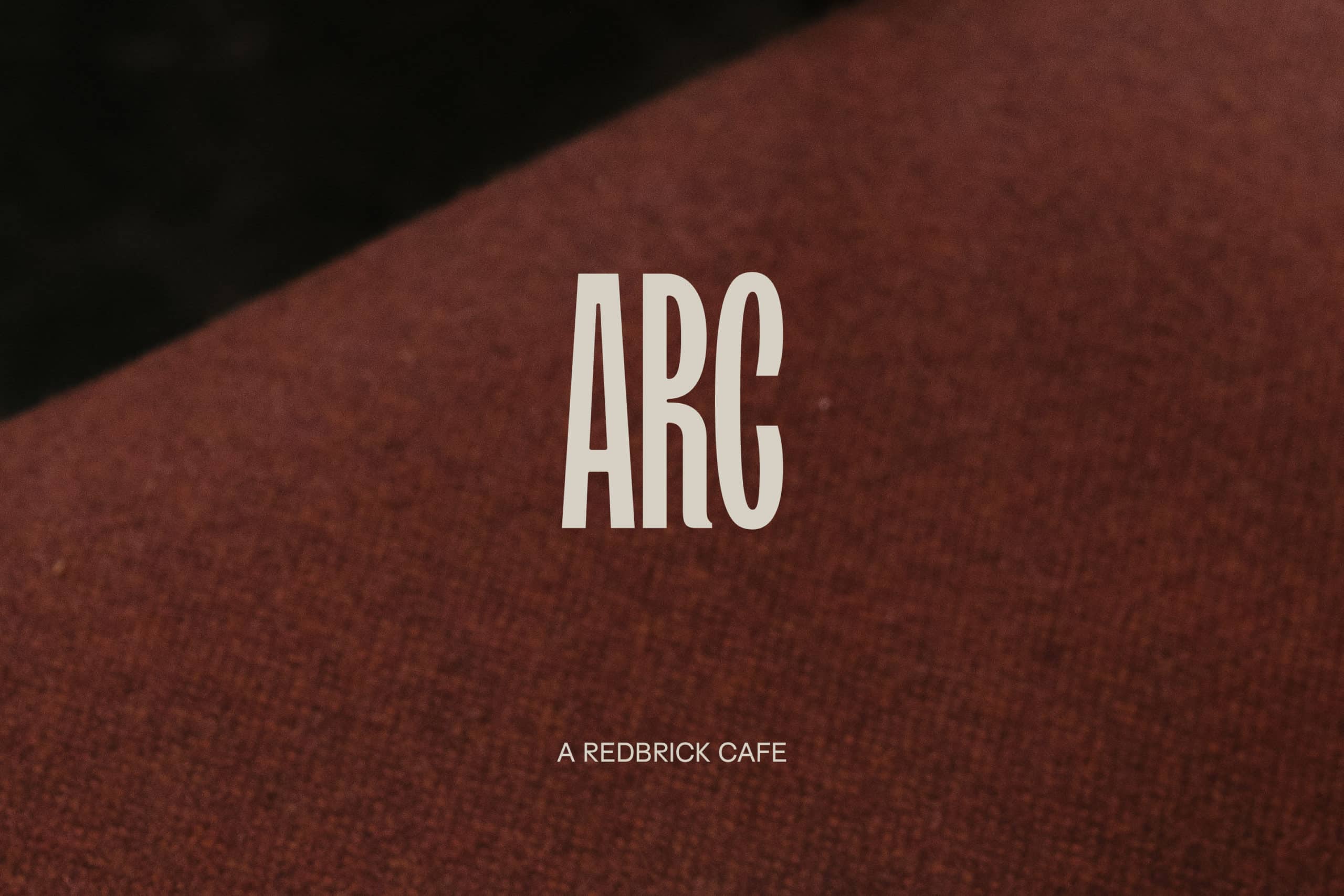 logo.jpgEnlarge
 -
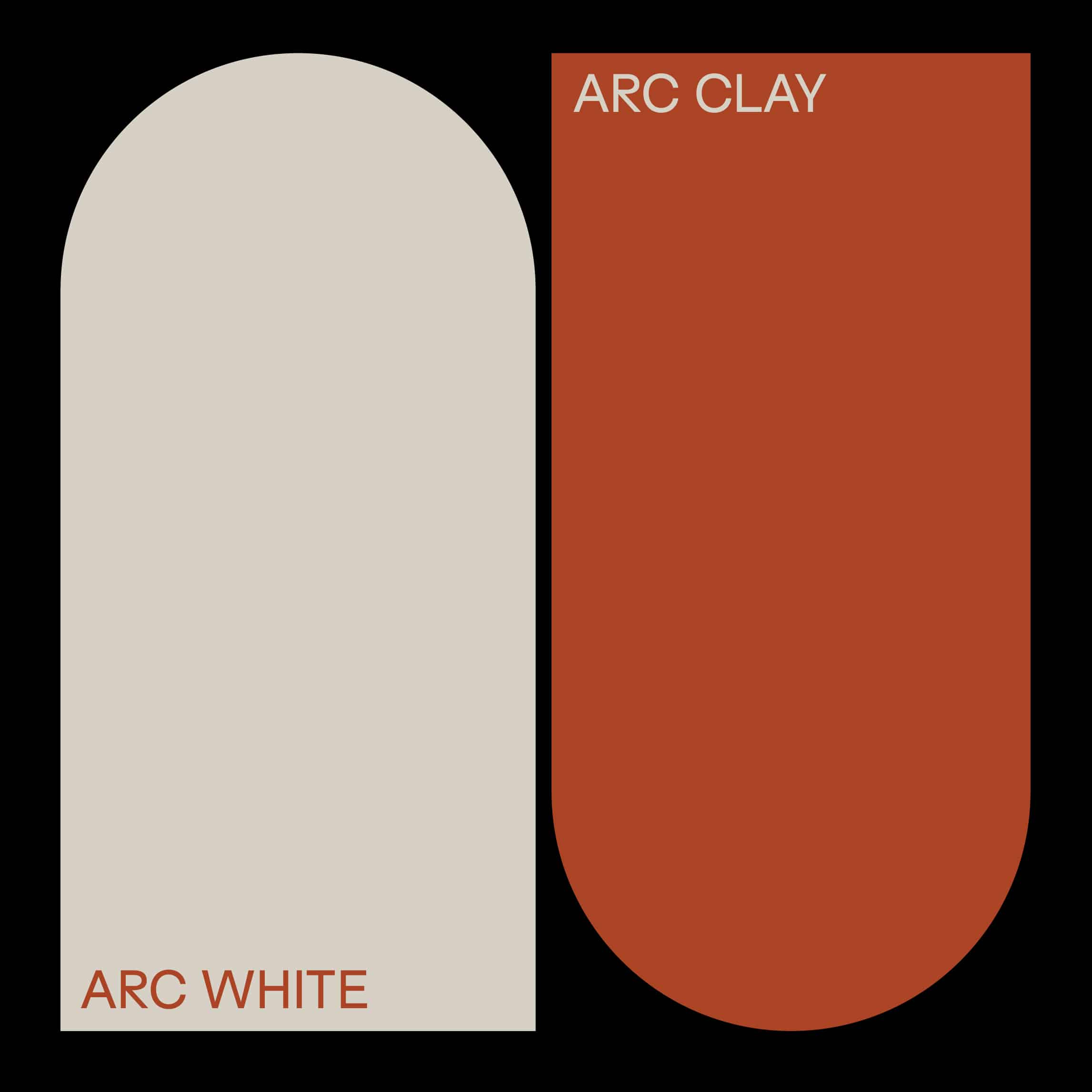 colour.jpgEnlarge
 -
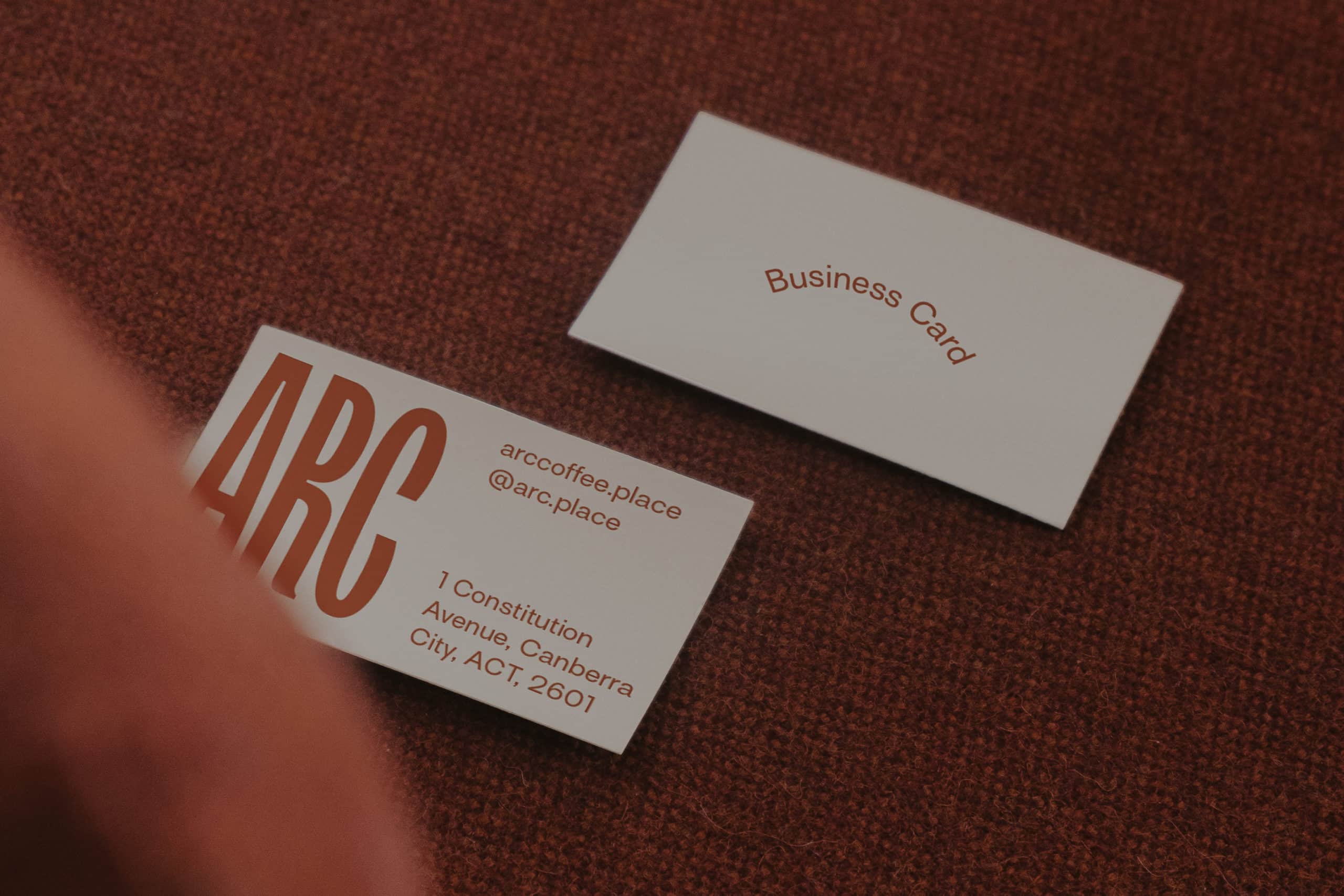 business-card.jpgEnlarge
 -
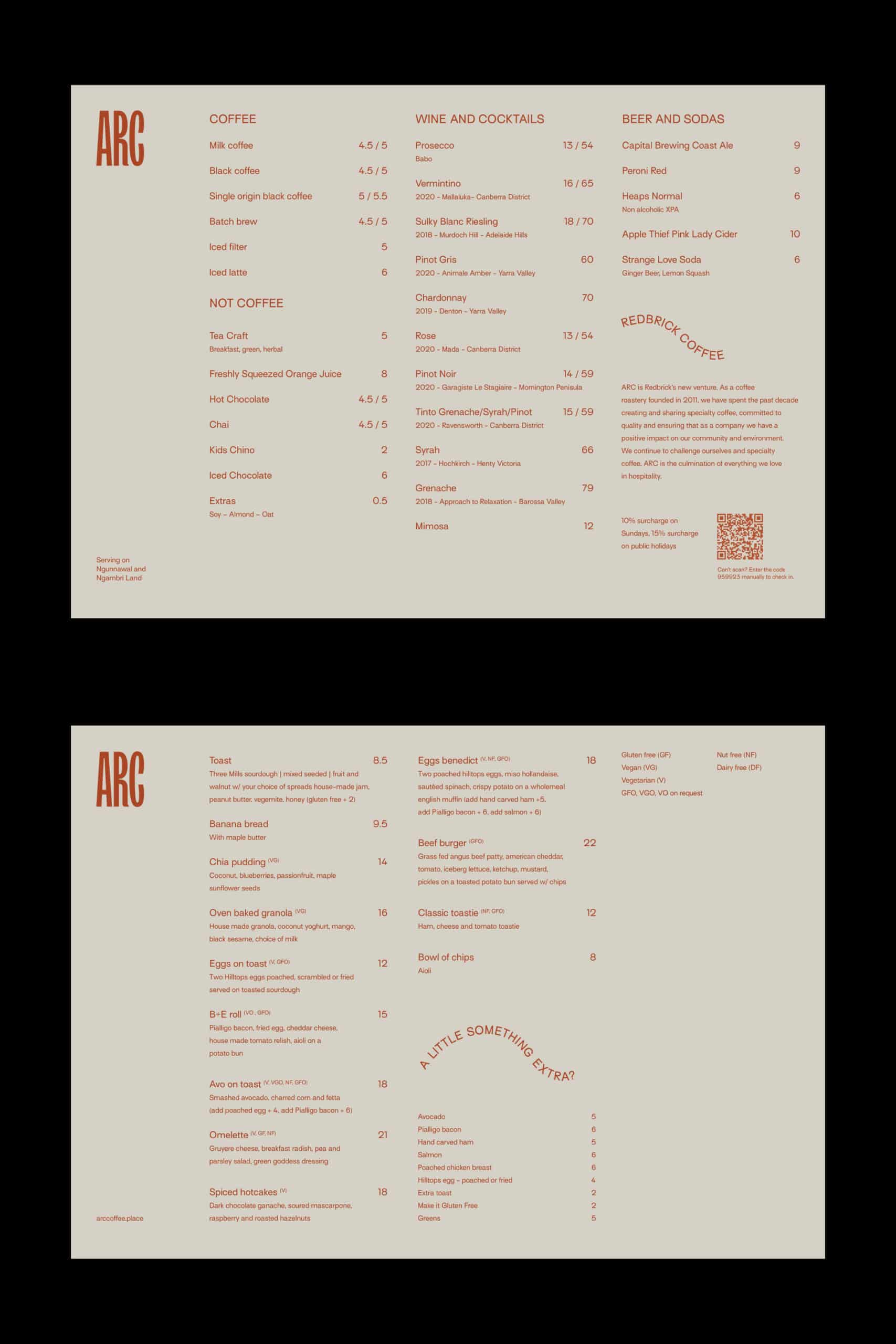 menu.jpgEnlarge
 -
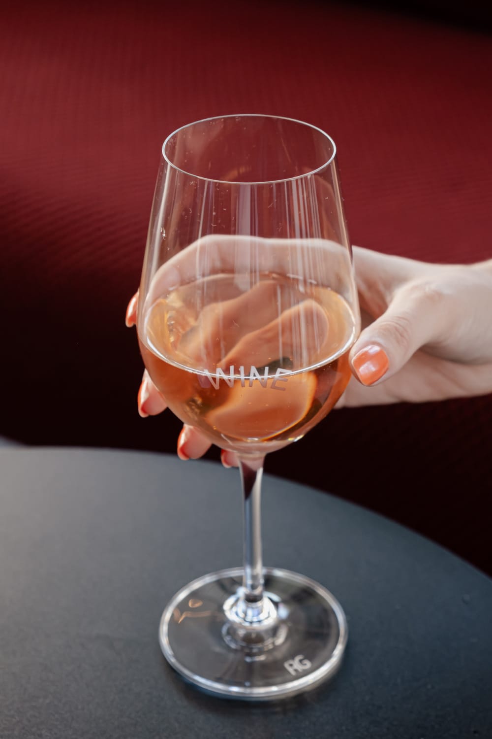 wine-glass.jpgEnlarge
 -
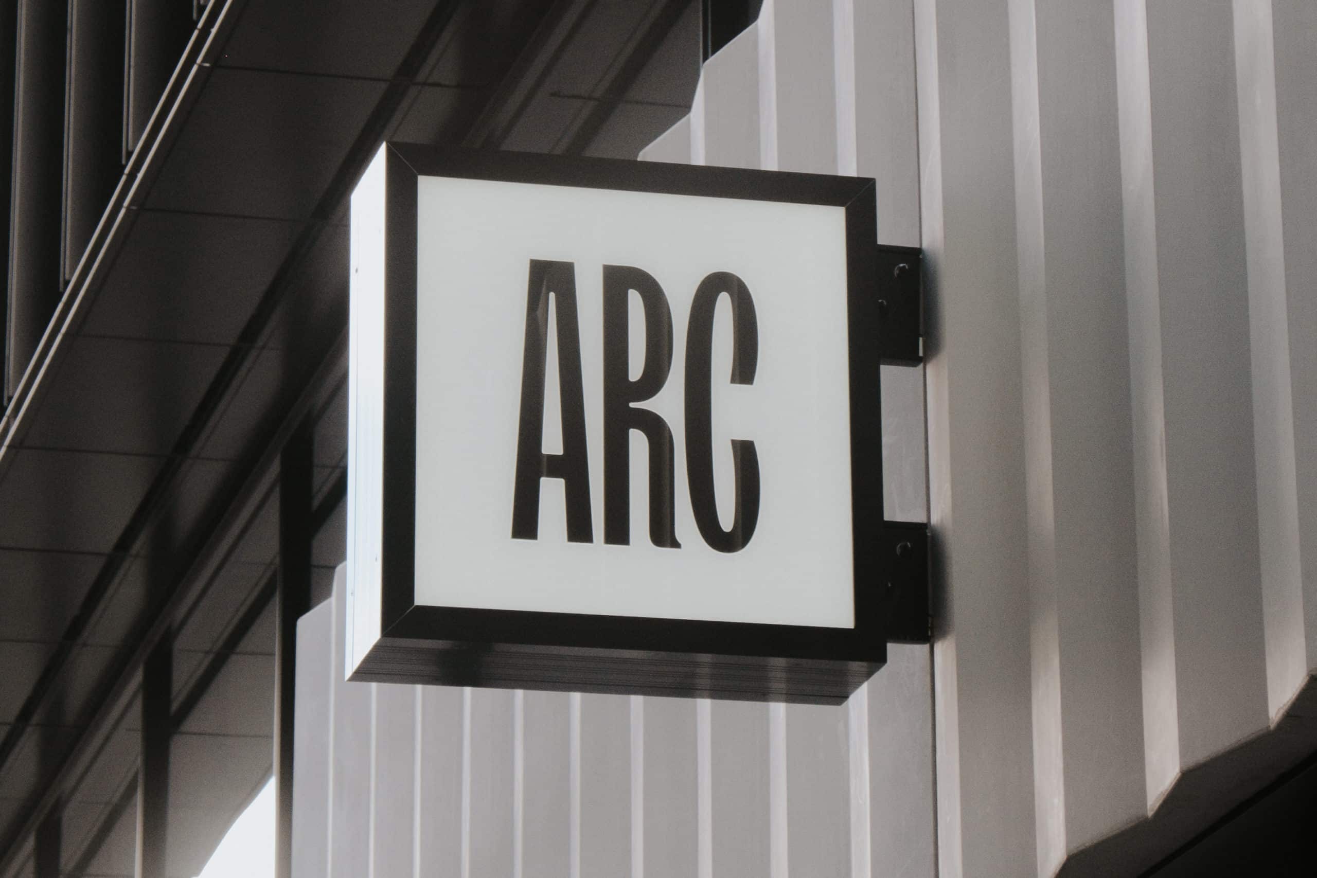
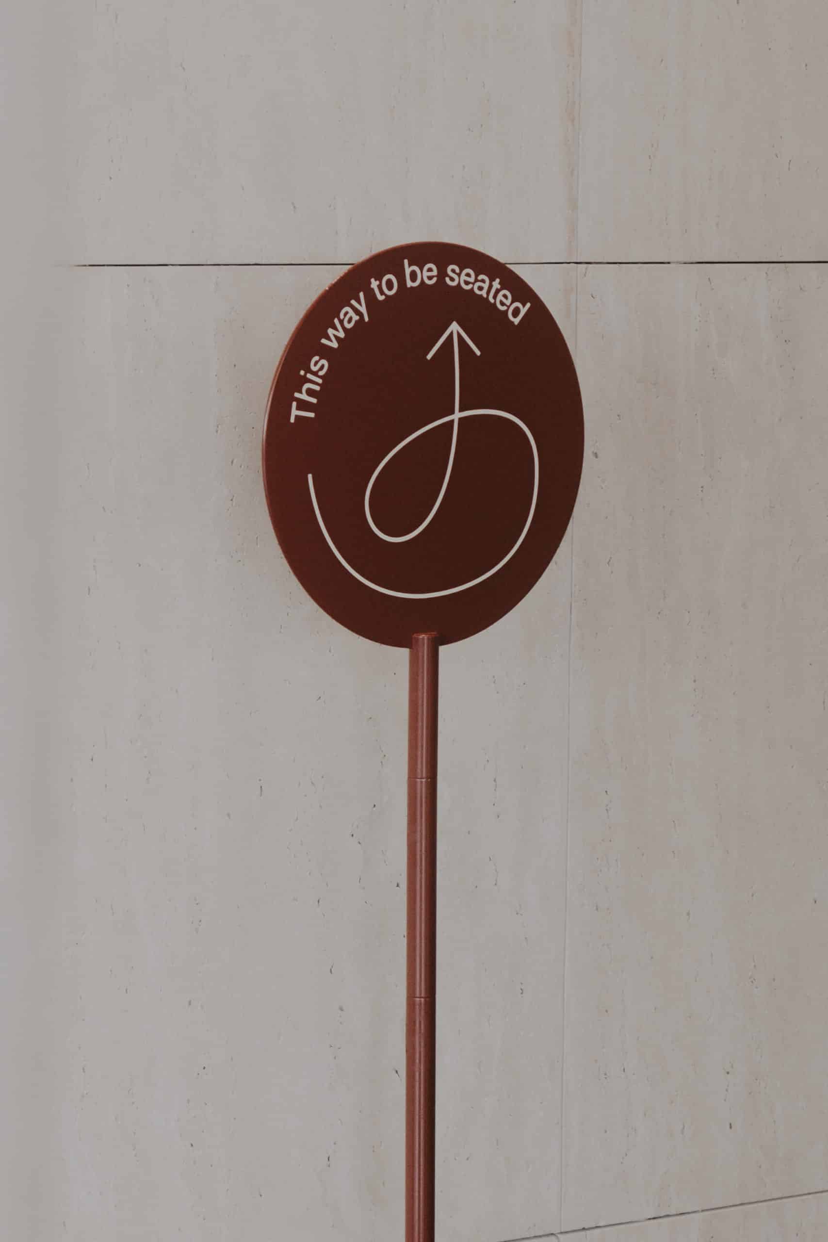 signage.jpgEnlarge
 -
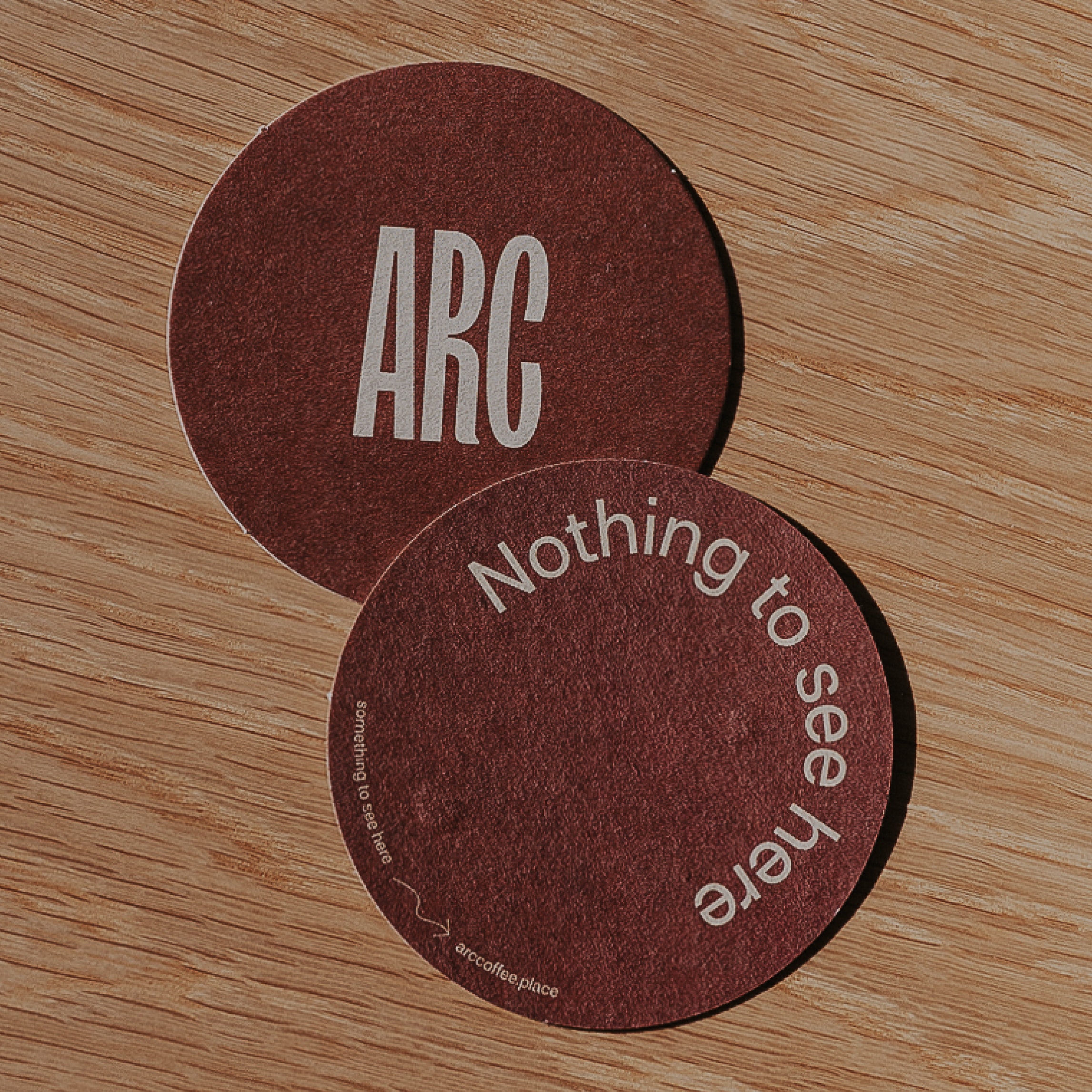 coaster.jpgEnlarge
 -
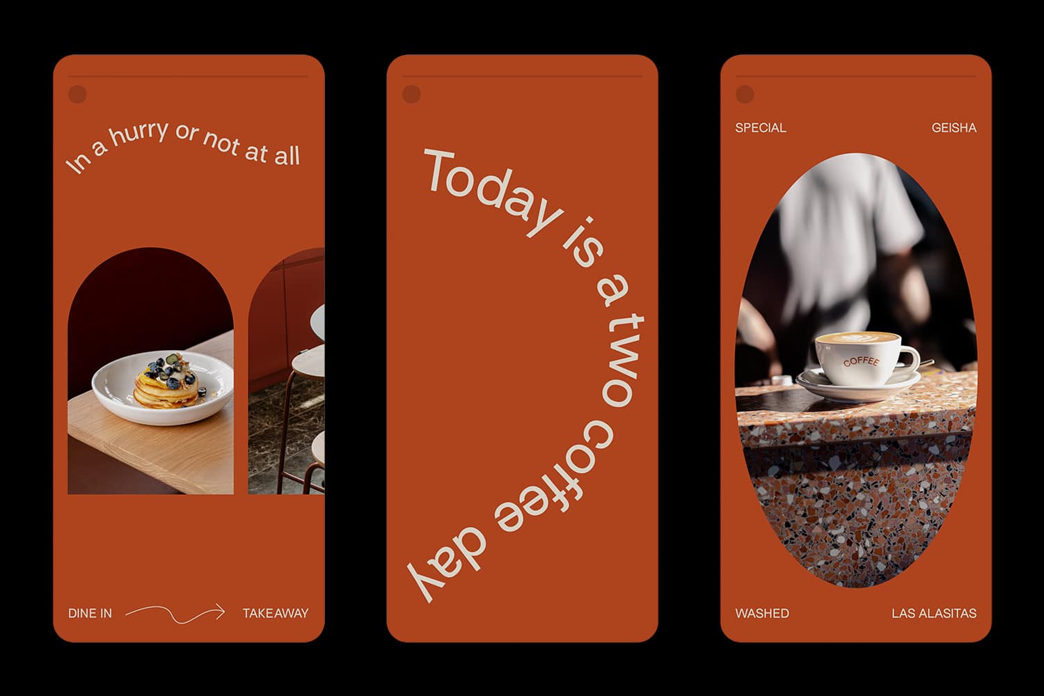 stories.jpgEnlarge
 -
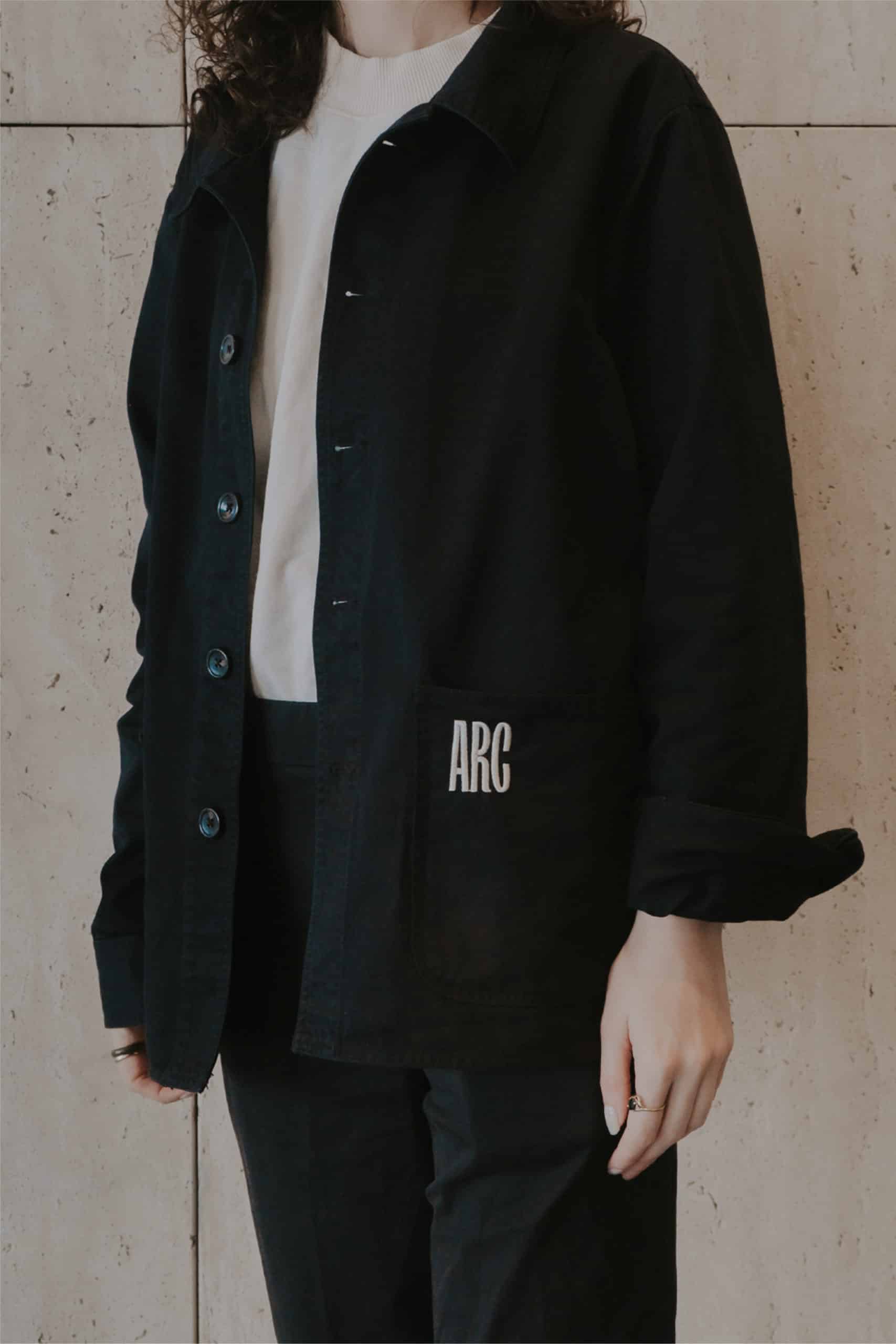 jacket.jpgEnlarge
 -
website.mp4Enlarge
-
 lightbox.jpgEnlarge
The brief was to develop a name and a brand that reflected the key pillars of a new cafe concept from Redbrick Coffee Roastery.
The name and brand had to stand firm as an independent brand, while also intrinsically linking to the key pillars of the cafe’s original concept; the homegrown nature, the coffee roastery, and the venue’s unique positioning in the most curved point of a new precinct.
The name ARC was born from this, and each design touchpoint was extrapolated from here. The first consideration was exploring ARC’s visual identity through the shape. The second consideration explored the cafe’s literal location in the arc of a building. The third consideration explored the idea of primary themes, naming things for what they are, the same way the cafe was named for the building curve it is placed within. The result was the establishment of a playful brand mark, serpentine copy, and distinct identifiers on all cafe collateral.


